wisp-chart
Data structs in, scene-graph subtrees out.
wisp-chart is the opinionated chart composition layer for
wisp. It turns "rows × bars ×
time" (Gantt) — and eventually bar / line / area — into a
wisp::scene::Node that drops straight into a wisp::Stage.
wisp-chart depends on wisp, never the reverse. Every
chart-specific dependency (jiff for dates, palette types,
contrast utils) lives in wisp-chart/Cargo.toml only — wisp
stays a Pixi-equivalent primitive renderer with zero awareness
of charts, dates, themes, or palettes.
What this book covers
- Gantt — the v1 composition. Hyper-specific first example (one concrete year, one concrete team) so the API has zero degrees of freedom before we iterate on flexibility.
- Web demo — running the same chart in a Chrome
<canvas>via WebGPU. Same crate, same code, different surface.
What this book does not cover
- The wisp renderer itself — see the wisp book.
- The Screen recorder application — see the Screen book.
Three books, one site
This is the third mdBook in the Screen monorepo, mounted at
/Screen/wisp-chart/. The other two:
| Path | Book | Source |
|---|---|---|
/Screen/ | Screen recorder | _docs/book/ |
/Screen/wisp/ | wisp renderer | _docs/wisp-book/ |
/Screen/wisp-chart/ | This book | _docs/wisp-chart-book/ |
Cross-book links go through the mdbook-preprocessor-cross
tags so they survive the deployed path-based routing.
Quickstart
Add wisp-chart to a workspace crate that already depends on
wisp. The chart-specific dep jiff rides in via wisp-chart
— don't add it to your own Cargo.toml unless you need
jiff directly.
[dependencies]
wisp.workspace = true
wisp-chart = { path = "../wisp-chart" }
Build the smallest possible Gantt:
use wisp_chart::{Bar, DateRange, Gantt, Row, Theme};
use jiff::civil::date;

let chart = Gantt {
    range: DateRange::year(2026),
    rows: vec![Row::new("vec", "M-VEC")],
    bars: vec![Bar::new(
        "vec",
        date(2026, 2, 1)..date(2026, 3, 15),
        "Matt",
    )],
    people: Default::default(),
};

let node = chart.render(&Theme::light());
stage.add(node);
```admonish note title="Gantt::render lands in M-CHART.0 chunk 3"
The foundation commit (chunk 1) ships the data + theme + palette
modules. The render pass — Gantt::render(&Theme) -> SceneNode
— follows in chunk 3. Until that
chunk lands, the snippet above is illustrative; build with
cargo check -p wisp-chart to confirm the data API.
## Run it in a browser

The same crate compiles for `wasm32-unknown-unknown` and
renders into a `<canvas>` via WebGPU. See
[Run wisp-chart in Chrome via WebGPU](./web-demo.md).
Where this book sits
wisp-chart is one of three mdBooks composed into the same
GitHub Pages artifact.
flowchart LR
    Screen["/Screen/<br/>screen recorder"]:::shell
    Wisp["/Screen/wisp/<br/>wisp renderer"]:::wisp
    Chart["/Screen/wisp-chart/<br/>chart compositions"]:::chart
    Api["/Screen/api/<br/>rustdoc"]:::api

    Chart -->|depends on| Wisp
    Screen -->|uses| Wisp
    Screen -->|uses| Chart

    classDef shell fill:#1e293b,stroke:#475569,color:#e2e8f0
    classDef wisp fill:#7c2d12,stroke:#ea580c,color:#fed7aa
    classDef chart fill:#312e81,stroke:#6366f1,color:#e0e7ff
    classDef api fill:#374151,stroke:#9ca3af,color:#f3f4f6
Cross-book tags
The mdbook-preprocessor-cross tags resolve per-book. Inside
this book:
| Tag | Renders as |
|---|---|
/Screen/wisp/wisp/overview.html | /Screen/wisp/wisp/overview.html |
./charts/gantt/api.html | ./charts/gantt/api.html (relative — same book) |
| ````admonish info title="Cross-book link convention" | |
| This is one of two sibling mdBooks deployed to the same GitHub | |
| Pages site: |
- Project book —
/Screen/(recorder + capture + encoder + Tauri shell). - Wisp book —
/Screen/wisp/(renderer-only reference; publishable to crates.io independently).
Cross-references in either book go through the
mdbook-preprocessor-cross preprocessor so URLs adapt per book:
\{\{wisp-link path/to/chunk\}\}— emits a relative URL inside the wisp book, an absolute/Screen/wisp/path/to/chunk.htmlURL from the project book.\{\{shared path/to/fragment.md\}\}— inlines a markdown fragment from_docs/shared/(this snippet you're reading is one).
Plain markdown links from the wisp book back to the project use
absolute URLs (/Screen/...) since the inverse direction is
single-target.
` | inlined from `_docs/shared/` |

Inside the screen + wisp books, the same `{{wisp-chart-link}}`
tag emits an absolute URL to `/Screen/wisp-chart/...`. Authors
write the tag once; the preprocessor adapts per book.
Chart gallery
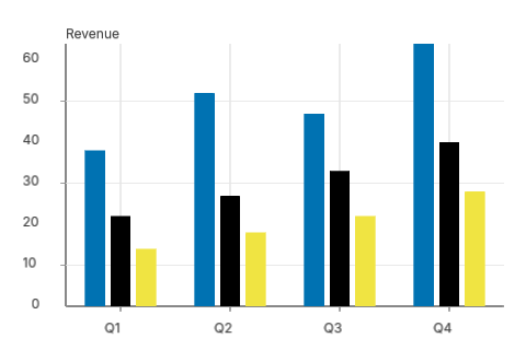
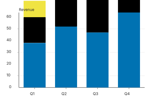
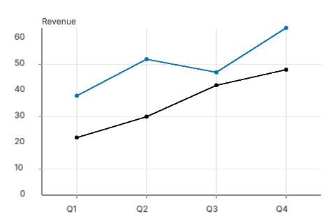
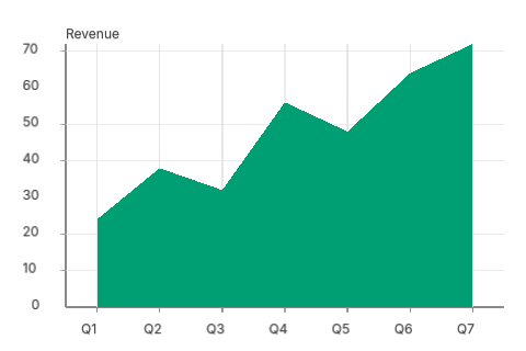
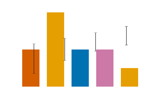
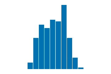
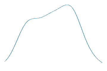
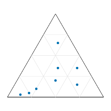
Every chart wisp-chart can render in one place. Click a
thumbnail to open the chapter; the live WebGPU demos are
embedded inside each.
Cartesian marks
Indicators

Finance

Polar
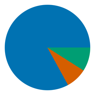
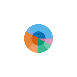
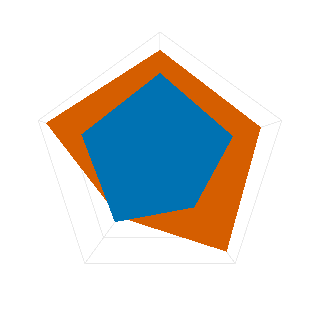

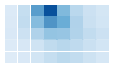
Heatmaps

Topology + multi-view
Distributions
Compositional + fields
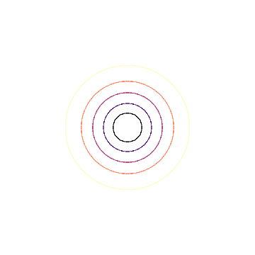
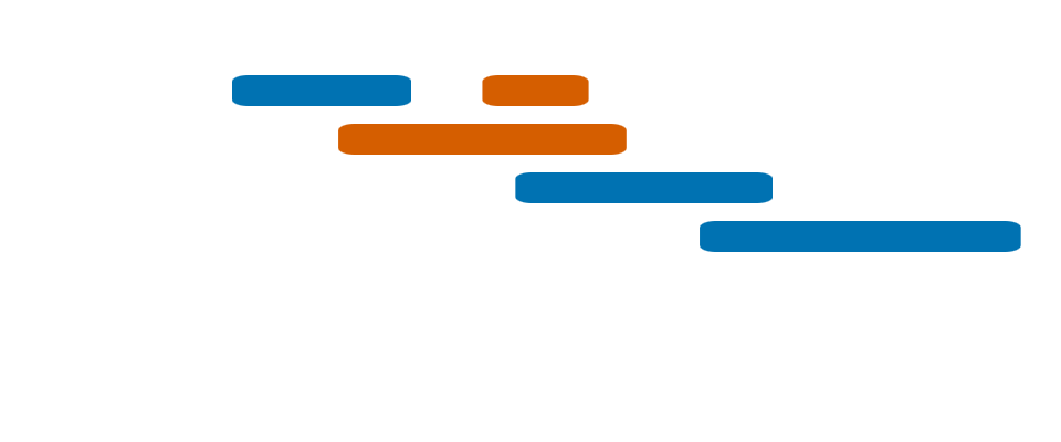
Gantt
Theme — shared across every chart family
wisp_chart::Theme is the single entry point that themes any
chart family consistently. Pick Theme::light() once and render
a Gantt, a bar chart, a KPI card, or a sunburst against it —
each chart family reads only from its own sub-theme plus the
top-level shared fields, so adding a new chart never reshapes
existing themes.
Shape
graph LR
    T[Theme]
    T --> bg[bg : Color]
    T --> tp[text_primary : Color]
    T --> tm[text_muted : Color]
    T --> pal[palette : OwnerPalette]
    T --> plot[plot : PlotTheme]
    T --> axis[axis : AxisTheme]
    T --> leg[legend : LegendTheme]
    T --> ind[indicator : IndicatorTheme]
    T --> gantt[gantt : GanttTheme]
    classDef shared fill:#7c2d12,stroke:#ea580c,color:#fed7aa
    classDef sub fill:#1e293b,stroke:#475569,color:#cbd5e1
    class bg,tp,tm,pal shared
    class plot,axis,leg,ind,gantt sub
Top row (orange) are the shared fields every chart family may
read. The five sub-themes (slate) are each owned by a specific
chart-family — theme.gantt.* is for Gantt, theme.plot.* /
theme.axis.* / theme.legend.* for cartesian families, and so
on.
A chart family reads only from its own sub-theme + the top-level
shared fields. Reaching into another chart family's sub-theme is
the structural coupling this decomposition exists to prevent.
Gantt code reads theme.gantt.*; a future bar chart will read
theme.plot.* + theme.axis.*; neither should ever touch the
other's fields.
Field inventory
PlotTheme:
gridline_major—LineStyle(default#cccccc, 2 px). Major-tick gridlines on cartesian / heatmap charts.gridline_minor—LineStyle(default#e5e5e5, 1 px). Minor-tick gridlines, e.g. weeks within a month.
AxisTheme:
tick_length_px— tick mark length in device pixels (default 5).tick_label_font_size— tick label font size (default 12).tick_density_hint— target number of ticks the auto-tick generator aims for (default 8).
LegendTheme:
swatch_size_px— colour box / line / marker size (default 14).item_spacing_px— spacing between legend items (default 8).item_font_size— legend item font size (default 12).
IndicatorTheme:
numeric_font_size— big-number font (default 32).delta_up— positive delta colour (default#27ae60green).delta_down— negative delta colour (default#e74c3cred).delta_neutral— neutral colour (default#888888muted).
GanttTheme:
row_alt_bg— alternating row tint (default#fafafa).header_bg— header band background (default#f5f5f5).grid_week/grid_month— Gantt-specific aliases for the plot gridlines (default mirrorstheme.plot.gridline_minor/gridline_major).bar_corner_radius— bar corner radius in pixels (default 6).bar_height— bar height in pixels (default 28).row_height— row height in pixels (default 44).gutter_width— left gutter width (default 180).header_height— header band height (default 60).
Customising
The common case is "use Theme::light() but tweak one knob":
#![allow(unused)]
fn main() {
let mut theme = wisp_chart::Theme::light();
theme.gantt.bar_corner_radius = 12.0;   // chunkier Gantt bars
theme.indicator.delta_up = wisp_chart::Color::from_hex("#10b981").unwrap();
}
Spreading a sub-theme onto a fresh Theme works too:
#![allow(unused)]
fn main() {
let theme = wisp_chart::Theme {
    gantt: wisp_chart::theme::GanttTheme {
        bar_corner_radius: 12.0,
        ..wisp_chart::Theme::light().gantt
    },
    ..wisp_chart::Theme::light()
};
}
Theme::dark() lands as a follow-on once the cartesian wave is
visible enough that dark-mode contrast checks are worth doing.
Verified by
crates/wisp-chart/src/theme.rs has four tests:
light_theme_uses_white_bg— top-levelbgdefaults to white.light_theme_gantt_dimensions_match_spec— the Gantt sub-theme preserves the pre-decomposition pixel sizes (28/44/180/60/6) byte-identically.light_theme_populates_every_sub_theme— every sub-theme has non-zero defaults where a real number is required.gantt_grid_lines_match_legacy_aliases— Gantt'sgrid_week/grid_monthtrack the plot gridlines, matching the original flat-Theme shape.
Plus the chart-web snapshot test
crates/wisp-chart-web/tests/render_gantt.rs continues to pass
unchanged: the Gantt PNG is byte-identical after the refactor.
Scales — domain → range mappings
Every cartesian / polar / heatmap chart maps abstract domain
values (numbers, categories, dates) into pixel coordinates
through a Scale. Building this once means every chart family
gets consistent tick placement, padding, and edge behaviour for
free.
What ships in v1
graph LR
    L[LinearScale<br/>continuous f32]
    B[BandScale<br/>discrete categories]
    O[OrdinalScale<br/>category → index]
    T[TimeScale<br/>jiff::Date]
    G[LogScale<br/>positive f32]
    L --> px1[f32 pixel range]
    B --> px2[band start/end + centre]
    O --> idx[usize index]
    T --> px3[f32 pixel range]
    G --> px4[f32 pixel range]
    classDef scale fill:#1e293b,stroke:#475569,color:#cbd5e1
    classDef out fill:#7c2d12,stroke:#ea580c,color:#fed7aa
    class L,B,O,T,G scale
    class px1,px2,px3,px4,idx out
| Scale | Used by |
|---|---|
LinearScale | bar (y), line, scatter, histogram, area, KPI sparkline |
BandScale | bar (x), grouped bar, box plot |
OrdinalScale | colour encoding lookups |
TimeScale | line / area with time-x, Gantt, candlestick |
LogScale | bubble x (GDP), histogram of skewed data |
Convention
All scales map domain → range, both as (f32, f32) tuples
(or category lists for band / ordinal). The convention is:
range.0corresponds to the left edge of the plot area for X scales and the bottom edge for Y scales. Callers pre-flip Y ranges so aLinearScale::new((0, 100), (plot_bottom_y, plot_top_y))puts low values at the bottom.- Tick generators return the domain values that should get tick
marks; the rendering layer projects each through
mapand draws.
Examples
LinearScale — d3-style nice-tick at 1/2/5 cadence per decade:
#![allow(unused)]
fn main() {
let x = wisp_chart::scale::LinearScale::new((0.0, 73.0), (0.0, 960.0));
let ticks = x.ticks(8);
// 0, 10, 20, 30, 40, 50, 60, 70 — step 10 chosen as the nice
// stop closest to 73/8 ≈ 9.1.
}
BandScale — discrete categories with padding:
#![allow(unused)]
fn main() {
let cat = wisp_chart::scale::BandScale::new(
    ["Q1", "Q2", "Q3", "Q4"],
    (180.0, 960.0),
).padding(0.1);
let (start, end) = cat.range_for(&"Q2").unwrap();
// Q2's band spans (start, end) with 10% gap each side.
}
TimeScale — multi-unit tick generator:
#![allow(unused)]
fn main() {
use jiff::civil::date;
use wisp_chart::gantt::DateRange;
use wisp_chart::scale::{TimeScale, TimeUnit};

let scale = TimeScale::new(DateRange::year(2026), (180.0, 960.0));
let unit = scale.pick_unit(8);          // returns TimeUnit::Month for a full year
let ticks = scale.ticks_at(unit);       // 12 month-starts
}
LogScale — 1/2/5 stops per decade:
#![allow(unused)]
fn main() {
let s = wisp_chart::scale::LogScale::new((1.0, 1_000.0), (0.0, 600.0));
// Ticks at 1, 2, 5, 10, 20, 50, 100, 200, 500, 1000.
}
What doesn't ship in v1
- Categorical sorting strategies —
OrdinalScalekeeps insertion order; explicit sort policies (alphabetical, by-count) follow as a chart-specific concern. - Non-natural-log bases for
LogScale— base-10 default; the tick generator's 1/2/5 cadence is tuned for decimal. Other bases work formapbut tick spacing won't match the base. - Time-axis localisation / week-start configuration — Mondays are the assumed week start, matching the existing Gantt convention.
Verified by
crates/wisp-chart/src/scale/*.rs — 37 unit tests across the
five scale types covering: round-trip mapping, reversed-range
handling, tick generation at nice stops, padding clamping, edge
cases (zero-width domain, missing categories, dates outside
range). All pass under cargo test -p wisp-chart --lib.
Plot facade — grammar of graphics
Plot is the ergonomic front door for cartesian / polar /
heatmap chart families. Build a chart by composing data + a mark
- encodings:
#![allow(unused)]
fn main() {
use wisp_chart::plot::{self, DataFrame, Mark, Plot, ScaleKind, Value};

let plot = Plot::new(df)
    .mark(Mark::Bar { value_labels: false })
    .encode(plot::x("quarter", ScaleKind::Band))
    .encode(plot::y("revenue", ScaleKind::Linear))
    .encode(plot::color("region"));
let graphics = plot.render(&theme, viewport_px);
}
That's the entire surface. Swap Mark::Bar for Mark::Line (when
it ships) and the same data + encodings render as a line chart.
Pieces
graph LR
    R[user rows] -->|from_rows + flatten| DF[DataFrame<br/>column-oriented]
    DF -->|encode| ENC[Encoding<br/>X / Y / Color]
    ENC -->|scale_kind| SK[ScaleKind<br/>Linear / Band / Ordinal / Time / Log]
    ENC --> P[Plot]
    M[Mark<br/>Bar / Line / Area / ...] --> P
    T[Theme] --> P
    P -->|render| G[wisp::Graphics]
    classDef data fill:#7c2d12,stroke:#ea580c,color:#fed7aa
    classDef api fill:#1e293b,stroke:#475569,color:#cbd5e1
    classDef out fill:#14532d,stroke:#16a34a,color:#bbf7d0
    class R,DF data
    class ENC,SK,M,T,P api
    class G out
DataFrame
User rows of any R type are flattened once via a closure into a
column-oriented DataFrame. Each column is either
Value::Number(f32) (feeds Linear / Log / Y scales) or
Value::Category(String) (feeds Band / Ordinal / Color
encodings). After the flatten, every encoding refers to columns
by name.
#![allow(unused)]
fn main() {
struct Sale { quarter: String, revenue: f32, region: String }
let df = DataFrame::from_rows(&rows, |s| vec![
    ("quarter".into(), Value::Category(s.quarter.clone())),
    ("revenue".into(), Value::Number(s.revenue)),
    ("region".into(),  Value::Category(s.region.clone())),
]);
}
Trade-off: pay an O(n × cols) flatten cost on construction, gain string-based encoding ergonomics + automatic scale-derivation from column values.
Mark
Mark is the drawable shape a Plot emits per row. v1 ships:
Mark::Bar { value_labels: bool }— rectangular bar, one per row.value_labelstoggle is parsed but not rendered yet (lands when the axis renderer arrives).
Follow-on tickets add Line, Area, Point, Cell, Box,
Candlestick, Polygon, Arc — each is one variant on this
enum + one renderer arm in Plot::render. The facade surface
stays stable.
Encoding
An Encoding wires one Channel (X / Y /
Color) to one DataFrame column with a chosen
ScaleKind. Convenience constructors:
| Helper | Channel | Default scale |
|---|---|---|
plot::x(field, scale_kind) | X | as specified |
plot::y(field, scale_kind) | Y | as specified |
plot::color(field) | Color | Ordinal |
Domain auto-derives from the column values:
Linearreadsnumeric_extent(column min/max).Band/Ordinalreaddistinct_categories(in insertion order).- Override the numeric domain explicitly with
.domain((lo, hi))on theEncoding.
The Color encoding is stored on the Plot but Mark::Bar v1
ignores it — single-color bars only. When Mark::Bar is
upgraded to multi-series (M-CHART.7 Grouped Bar / M-CHART.8
Stacked Bar) the Color encoding wires into palette lookup.
Single-series charts get their colour from theme.palette via
the X category hash.
What's deferred to the v1 follow-ups
This Plot facade is layout-stable but visually minimal for
v1. The chart-side TODOs that share this same render path:
- Axis renderer (AUT-183 / M-CHART.3) — emits tick lines + tick labels + axis titles. The plot area today reserves the gutter / header / footer pixels so axes can drop in without shifting bars.
- Legend renderer (AUT-184 / M-CHART.4) — colour swatches + labels for multi-series charts.
- Value labels on bars — currently inert (
Mark::Barcarries the flag).
All three land as commits that extend Plot::render without
changing the public API.
Verified by
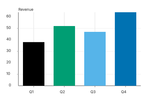
crates/wisp-chart/src/plot/*.rs— 13 unit tests covering DataFrame construction, distinct-category de-dup, numeric extent, encoding chain, channel replacement, NDC conversion, background-only fallback when encodings are missing.crates/wisp-chart-web/tests/render_bar.rs— integration test: builds a 4-quarter DataFrame, runs the fullPlot::new → mark → encode → renderchain, renders viawisp::Rendererto an offscreenRgba8Unormtexture, and asserts (1) header area is white, (2) the tallest bar's centre pixel is non-white. Also regenerates thebar-quarterly.pngsnapshot above.
What this unblocks
Every cartesian / polar / heatmap chart now has a stable surface to land against. The chart wave can proceed in parallel:
- M-CHART.6 Bar variants (grouped / stacked / 100%): add
encodings (
XOffset,Stacktransform). - M-CHART.9 Line, M-CHART.10 Area, M-CHART.11 Scatter, M-CHART.12
Bubble, M-CHART.13 Connected scatter: add
Markvariants + renderer arms. - M-CHART.20+ statistical charts: add
Transformenum (Bin,Density,Stack,RunningTotal) that runs before marks emit.
Axes
Axes are the gridlines, tick marks, tick labels, and axis titles
that frame a cartesian plot. The Plot facade emits them
automatically; this chapter documents the renderer behind that
default + the knobs the caller has.
What ships with the default render
A Plot rendered with default settings emits, in this order:
background → Y gridlines + Y axis line + Y tick marks →
X gridlines + X axis line + X tick marks → marks (bars, lines)
→ tick labels + axis title.
The order matters: gridlines + tick marks emit BEFORE marks so data primitives composite on top of the grid. Tick labels emit AFTER marks so they are never occluded by a tall bar.
Public surface
The renderer's primitives live in wisp_chart::axis.
Two pairs of functions, one pair per axis direction:
| Function | Returns | Purpose |
|---|---|---|
emit_x_axis_lines | wisp::Graphics | Bottom/top axis line + ticks + grid |
emit_y_axis_lines | wisp::Graphics | Left/right axis line + ticks + grid |
emit_x_axis_text | Vec<wisp::Text> | Tick labels + X-axis title |
emit_y_axis_text | Vec<wisp::Text> | Tick labels + Y-axis title (rotated -π/2) |
The lines/text split exists because wisp::Graphics and
wisp::Text are different node types — Graphics is composable
via Graphics::append,
Text needs a Font instance.
Why Plot needs axis_text_labels separately
Plot::render returns a single Graphics subtree. It cannot
emit Text nodes because text rendering needs a wisp::Font,
which depends on a live wgpu device. To keep wisp-chart's
public API device-free, the caller supplies the font:
let plot = Plot::new(df)
    .x_title("Quarter")
    .y_title("Revenue")
    .encode(plot::x("quarter", ScaleKind::Band))
    .encode(plot::y("revenue", ScaleKind::Linear));

// Marks + axis lines:
let graphics = plot.render(&theme, viewport);
let root = stage.root();
let _ = stage.add_child(root, graphics);

// Axis text — needs the Font:
let font = Font::bitmap_8x8(&app);
for text in plot.axis_text_labels(&theme, viewport, &font) {
    let _ = stage.add_child(root, text);
}
Disabling axes
For minimalist renders (sparklines, design previews), call
.axes(false) to skip every axis primitive. Useful when the
chart is embedded inside a card UI and the parent component
draws its own framing.
let plot = Plot::new(df).axes(false).mark(Mark::Bar { value_labels: false });Coordinate convention
The axis renderer takes pixel-space tick positions (top-left
origin, +Y down) and emits NDC primitives (+Y up). This
matches wisp's convention; wisp::math::Rect doc says +Y
down in source code but the renderer flips. Always think in
pixels in the chart layer; the conversion happens inside
emit_*_axis_*.
Legend
A legend maps a categorical Color encoding's values to their
palette swatches. The Plot facade exposes Plot::legend(theme)
to auto-build one from the data; callers can also construct a
Legend from scratch when the chart isn't a standard Plot.
Public surface
| Type | Purpose |
|---|---|
Legend | The composed legend value |
LegendItem | One swatch + label pair |
SwatchStyle | ColorBox / LineSample / PointMarker |
LegendOrientation | Vertical / Horizontal |
Swatch styles
The mark type drives swatch style: bars / areas / cells use
ColorBox; line + trend marks use LineSample; scatter / dot
marks use PointMarker. Mixing styles in one legend is allowed
when a chart layers multiple marks (e.g. a bar + line dual axis).
Auto-build from a Plot
let plot = Plot::new(df)
    .mark(Mark::Bar { value_labels: false })
    .encode(plot::x("quarter", ScaleKind::Band))
    .encode(plot::y("revenue", ScaleKind::Linear))
    .encode(plot::color("region"));

let legend = plot.legend(&theme);
// Caller positions + renders the legend separately:
let legend_graphics = legend.emit_graphics(
    Vec2::new(viewport.x - 120.0, 20.0),
    viewport,
    &theme.legend,
    font.cell_pixels() as f32,
);
let _ = stage.add_child(root, legend_graphics);

let labels = legend.emit_text_labels(
    Vec2::new(viewport.x - 120.0, 20.0),
    viewport,
    &theme.legend,
    theme.text_primary,
    &font,
);
for t in labels {
    let _ = stage.add_child(root, t);
}
Orientation
| Orientation | When to use |
|---|---|
| Vertical | Narrow side panels, tall charts, many categories |
| Horizontal | Above / below the plot area, ≤ ~6 categories, wide |
Horizontal layouts wrap to a new row when the running x exceeds the viewport width.
Manual construction
Use the builder when the legend isn't 1:1 with a Plot's color
encoding — e.g. annotating two reference lines on a custom chart
or pulling the same legend into multiple charts.
let legend = Legend::new()
    .item("Q1", SwatchStyle::ColorBox(navy))
    .item("Q2", SwatchStyle::ColorBox(vermillion))
    .orientation(LegendOrientation::Horizontal);
Line chart
A line chart connects rows of a DataFrame in order with a
stroked polyline. Multi-series support comes via a Color
encoding: each distinct category becomes its own line.
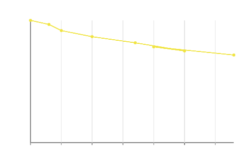
Demo — US unemployment rate, 1929–1941
The demo plots annual US unemployment through the Great
Depression and into early World War II. The peak (24.9 % in
1933) is the worst single year on record; the 1937–38 secondary
peak is the "Roosevelt Recession" after premature monetary
tightening. The chart fades in over 1.5 s with Ease::OutCubic
— a subtle "the chart is rendering itself" cue rather than a
hard appear.
Source: Unemployment in the United States — Wikipedia
Public surface
let plot = Plot::new(daily)
    .mark(Mark::Line {
        interpolation: Interpolation::Linear,
        marker: Some(PointStyle::Circle),
    })
    .encode(plot::x("date", ScaleKind::Band))
    .encode(plot::y("value", ScaleKind::Linear))
    .encode(plot::color("metric"));
Mark variants
| Variant | When to use |
|---|---|
Mark::Line { Linear, None } | Standard time-series / continuous-x lines |
Mark::Line { Step, None } | Monotonic step series (quarterly milestones, billing tiers) |
Mark::Line { *, Some(Circle) } | Sparse data — readers spot individual points |
Interpolation
Interpolation::Linear connects (x₁, y₁) → (x₂, y₂) directly.
Interpolation::Step inserts an L-shaped joint at (x₂, y₁),
producing horizontal-then-vertical segments. Each step segment
doubles the primitive count vs Linear.
Multi-series via Color encoding
When a Color encoding is present, the renderer splits rows by
the color column's value and emits one polyline per series. Each
series picks a palette colour from the theme. Use Plot::legend
to auto-build a matching legend.
Theme integration
| Theme field | Drives |
|---|---|
theme.plot.line_width_px | Stroke thickness of every line |
theme.plot.line_marker_radius_px | Radius of PointStyle::Circle markers |
theme.palette | Per-series stroke colour |
Coordinate convention
For the Band X scale (categorical x), each row's x position is
the centre of its band. For continuous X (Linear scale on a
numeric column), the x position is the scale's map(value). The
fundamental NDC flip is the same as bars — see Axes
for the coordinate-convention note.
Grouped bar chart
Side-by-side comparison of 2–5 series within each X-band — e.g. revenue per region per quarter. Each outer band (a quarter) is subdivided into one inner band per series (a region).
Demo — Apollo crewed missions per year, 1968–1972
The plain-bar variant (?chart=bar) below plots crewed Apollo
missions flown per calendar year. 1969 carries four flights
(Apollo 9 LM rehearsal, Apollo 10 lunar reconnaissance, Apollo
11 first landing, Apollo 12 second landing) — the program's
single most ambitious year. By 1972 only Apollo 17 flew.
Source: Apollo program — Wikipedia
Grouped variant — Apollo annual budget by NASA centre
The same Apollo dataset, sliced differently. Annual program outlays ($B, 1973 dollars) for five reference years (1962, 1964, 1966, 1969, 1972), grouped by the three centres that owned the spend: Marshall (Saturn V), Manned Spacecraft Center (CSM + LM), and Kennedy (launch ops + tracking). The 1966 peak matches the late-stage Saturn V flight-hardware build right before Apollo 4's all-up test.
Source: Apollo program — Costs — Wikipedia
Public surface
The grouped layout is one extra encoding on top of the standard bar chart:
let plot = Plot::new(rows)
    .mark(Mark::Bar { value_labels: false })
    .encode(plot::x("quarter", ScaleKind::Band))
    .encode(plot::y("revenue", ScaleKind::Linear))
    .encode(plot::color("region"))
    .encode(plot::x_offset("region"));
Adding plot::x_offset(field) re-bands the X axis: each unique
value of field becomes a sub-band within the outer X band.
Layout
The outer X band (e.g. "Q1") spans some pixel range
[bx0, bx1]. The grouped layout constructs an inner
BandScale over the distinct XOffset categories with that
range as its pixel range and a 10% inner padding, then asks for
the sub-band's [ix0, ix1].
Pairing with Legend
When the same column drives both Color and XOffset,
Plot::legend
returns a legend whose colours match the bar segments exactly.
Use the legend chapter for placement.
Theme integration
Grouped bars reuse the bar palette + theme. Inner band padding
is fixed at 0.10 today; an explicit PlotTheme.bar_inner_padding
field lands when the value needs to be customisable.
Stacked bar chart
Stacked bars show composition within a category — revenue per region as fractions of the quarterly total. Normalized mode divides each segment by its band's total, producing 100%-stacked bars where every band reaches the plot top.
The demo plots the Apollo program's annual outlay by NASA centre, 1962–1972 ($B in 1973 dollars). Same dataset the grouped-bar chapter shows side-by-side, but stacked: total program spend per year reads off the top of each bar, and the Marshall (Saturn V) slice growing through 1966 before tapering tells the program-arc story in one chart.
Source: Apollo program — Costs — Wikipedia
Public surface
use wisp_chart::plot::Transform;

let plot = Plot::new(rows)
    .mark(Mark::Bar { value_labels: false })
    .encode(plot::x("quarter", ScaleKind::Band))
    .encode(plot::y("revenue", ScaleKind::Linear))
    .encode(plot::color("region"))
    .transform(Transform::Stack { normalize: false });
Two modes from one transform
Transform::Stack { normalize } | Behaviour |
|---|---|
false | Cumulative absolute values — Q1 stack hits Q1 total |
true | Each band rescaled to the y-domain top — every bar reaches 100% |
The renderer walks rows in DataFrame order, accumulating a
per-band cumulative offset. The first row for a band sits at the
baseline; subsequent rows stack on top. The series colour comes
from the Color encoding's palette lookup.
Pairing with Legend
Use Plot::legend
to auto-emit a legend that maps colours to series — same shape as
grouped bars, and the legend's swatches use the same palette
positions as the stacked segments.
Stack + XOffset = grouped-stacked
Combining Transform::Stack with Encoding::XOffset is allowed:
each outer X band is sub-banded by XOffset, and within each
sub-band the rows stack by Color. Useful for "stacked by
component within grouped by quarter" layouts.
Scatterplot
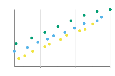
Two continuous numeric variables plotted as points — correlation explorations, A/B comparisons, sample distributions. Categorical colour and varying size for richer reads.
The demo plots Fisher's Iris (1936): petal length × petal width across the three species setosa, versicolor, and virginica. R.A. Fisher published this dataset in The Use of Multiple Measurements in Taxonomic Problems to demonstrate linear discriminant analysis; it has since anchored statistical classification, machine-learning tutorials, and 90 years of shape-from-petal arguments.
Source: Iris flower data set — Wikipedia
Public surface
let plot = Plot::new(samples)
    .mark(Mark::Point { shape: PointShape::Circle })
    .encode(plot::x("height", ScaleKind::Linear))
    .encode(plot::y("weight", ScaleKind::Linear))
    .encode(plot::color("species"))
    .encode(plot::size("age"));
Point shapes
| Shape | Primitive used |
|---|---|
Circle | Graphics::draw_ellipse |
Square | Graphics::draw_rect |
Diamond | Graphics::draw_polygon (4 verts) |
Triangle | Graphics::draw_polygon (3 verts) |
Plus | Two crossed draw_rect calls |
Both X and Y must use ScaleKind::Linear — scatter requires
continuous numeric axes. Categorical X is the domain of bar
charts.
Size encoding
Adding plot::size(field) maps a numeric column to marker
radius via LinearScale mapped into (3.0, 18.0) pixel range.
Use sparingly — too many sizes overlap and obscure the
distribution shape.
Theme integration
| Theme field | Drives |
|---|---|
theme.plot.line_marker_radius_px | Default marker radius (no Size) |
theme.palette | Per-category fill colour |
Bubble chart
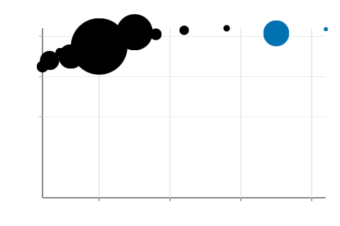
A bubble chart is a scatterplot with a third magnitude encoded as marker size — the canonical multi-channel "ah ha" plot.
The demo plots Gapminder 2007: GDP per capita (PPP) × life expectancy × population across 13 countries, coloured by continent. Hans Rosling made this dataset famous in his 2006 TED talk "The best stats you've ever seen", animating the same encoding from 1800 → present to show every country's simultaneous arc through rising income + rising lifespan.
Source: Gapminder Foundation — Wikipedia
Public surface
let plot = Plot::new(countries)
    .mark(Mark::Point { shape: PointShape::Circle })
    .encode(plot::x("gdp", ScaleKind::Log))
    .encode(plot::y("life_expectancy", ScaleKind::Linear))
    .encode(plot::size("population").size_mapping(SizeMapping::Area))
    .encode(plot::color("continent"));
Area vs radius mapping
Always use SizeMapping::Area for magnitude data. Radius
mapping is visually misleading: a 4× value renders 16× larger
because area = πr². Area mapping preserves the perceptual link
between value and visible bubble size.
SizeMapping | Behaviour | When to use |
|---|---|---|
Area (default) | sqrt(scaled value) → radius. 4× value → 4× visible bubble. | Magnitudes, populations, totals |
Radius | Scaled value → radius directly. | When the value is already a length/distance |
Multi-encoding read
A typical bubble chart uses 4 channels at once: X, Y, Size,
Color. Combined with Plot::legend,
the reader sees the Color legend automatically; future tickets
will add an explicit Size legend overlay for the third dimension.
Area chart
A line chart whose region between the curve and the baseline is filled. Use for magnitude-over-time visualisations where the area under the curve carries meaning.
Demo — NASA's share of the US federal budget, 1962–1972
The demo plots NASA spending as a percentage of the US federal
budget through the Apollo era. The 1966 peak (~4.4 %) and the
sharp post-Apollo wind-down to <2 % by 1972 tell the rise-and-fall
of the moon program in one shape. Reveal eases in over 1.5 s
with Ease::OutCubic.
Source: Budget of NASA — Wikipedia
Public surface
let plot = Plot::new(daily)
    .mark(Mark::Area { interpolation: Interpolation::Linear })
    .encode(plot::x("date", ScaleKind::Band))
    .encode(plot::y("value", ScaleKind::Linear))
    .encode(plot::color("region"));
Convex-quad-per-segment emission
wisp's draw_polygon is convex-only in v1 — it fan-triangulates
from vertex 0, which produces overlapping triangles when the
input polygon is non-convex. A typical area chart polygon
(line + baseline) is non-convex whenever the line bends.
The renderer sidesteps this by emitting one convex
quadrilateral per segment: (x0, baseline) → (x1, baseline) → (x1, y1) → (x0, y0). Each quad is always convex, so the fan
triangulation is correct. Visually identical to one big polygon;
costs one extra primitive per segment.
Interpolation modes
| Mode | Quad shape |
|---|---|
Linear | Slanted top edge connecting (x0, y0) → (x1, y1) |
Step | Flat top edge at y0 from x0 to x1 (step bar) |
Pairing with Color encoding
A Color encoding splits rows into one series per category and
emits one polygon stream per series. Without an explicit
back-to-front render order today, overlapping areas can occlude
each other; future tickets will add z-ordering by series area.
Connected scatterplot
A scatterplot whose points are joined by a line in a meaningful sequence — usually time. The reader sees the trajectory through 2D space, not just where points cluster.
The demo plots the US Phillips curve, 1960 → 1980, with
annual (inflation, unemployment) pairs joined in chronological
order. The 1960s sit in the lower-left in the classic downward
trade-off; the 1970s stagflation shock punches the line out
toward the upper-right (both axes climbing together) — the
empirical observation that broke Keynesian consensus and
powered Milton Friedman's natural-rate theory.
Source: Phillips curve — Wikipedia
Public surface
let plot = Plot::new(quarterly)
    .mark(Mark::Line {
        interpolation: Interpolation::Linear,
        marker: Some(PointStyle::Circle),
    })
    .encode(plot::x("inflation", ScaleKind::Linear))
    .encode(plot::y("unemployment", ScaleKind::Linear))
    .encode(plot::order("quarter_index"))
    .encode(plot::color("decade"));
The minimum recipe: a line mark with markers on, X and Y both
Linear, and an order encoding that names the sort column.
Order encoding
Encoding::Order sorts each series's rows by the named
numeric column before line-segment emission. Without it, rows
are connected in DataFrame insertion order — fine for already-
sorted time series, wrong for shuffled input. Always set it when
your reader expects the line to follow time.
Continuous-X line vs band-X line
The Plot facade detects the X scale kind and routes:
X ScaleKind | Layout | Use case |
|---|---|---|
Linear / Log / Time | Continuous numeric axes | Connected scatter, time-series |
Band (default) | Categorical bands at centres | Standard line chart, e.g. quarterly |
Same Mark::Line mark; different X scale picks the right
projection automatically.
KPI / indicator card
A dashboard summary tile: one big number, a one-line label, a colour-coded delta, optional sparkline.
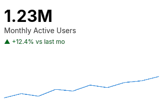
The demo reports Apollo 11 lunar surface samples returned — 47.5 lb (21.6 kg), 2.5 lb under the mission's 50 lb pre-flight goal. The sparkline traces all six Apollo landings: 11 / 12 / 14 / 15 / 16 / 17. The visible "hockey stick" from sample 4 onwards is the Lunar Roving Vehicle arriving with Apollo 15 in 1971 — once astronauts could traverse kilometres instead of a hundred metres, sample mass quintupled.
Public surface
use wisp_chart::indicator::{Kpi, Delta, DeltaKind};

let kpi = Kpi {
    value: 1_234_567.0,
    label: "Monthly Active Users".into(),
    delta: Some(Delta {
        kind: DeltaKind::Up,
        formatted: "+12.4% vs last mo".into(),
    }),
    sparkline: Some(vec![100.0, 105.0, 102.0, 110.0, 115.0]),
};

// Sparkline as Graphics:
let sparkline = kpi.emit_graphics(&theme, Vec2::new(240.0, 120.0));
let _ = stage.add_child(root, sparkline);

// Big number + label + delta as Text:
let font = Font::bitmap_8x8(&app);
for t in kpi.emit_text_labels(&theme, Vec2::new(240.0, 120.0), &font) {
    let _ = stage.add_child(root, t);
}
Numeric formatting
format_value
compacts large magnitudes into the closest power-of-thousand
abbreviation:
| Value | Rendered |
|---|---|
2_500_000_000 | 2.50B |
1_234_567 | 1.23M |
45_678 | 45.7K |
789 | 789 |
1.5 | 1.50 |
Override by formatting your value into a string and storing it
in Delta.formatted if you need locale-specific formatting.
Delta colours
DeltaKind::Up reads theme.indicator.delta_up (green by
default), Down reads delta_down (red), Neutral reads
delta_neutral (grey). The arrow glyph is ^ / v / - in
v1 — replace with proper Unicode arrows once the bitmap atlas
covers them.
Layout
The card is laid out within a viewport_px rectangle:
| Region | Position |
|---|---|
| Value | y = 12 px, left-aligned 8 px padding |
| Label | Below value with 8 px gap |
| Delta | Below label with 8 px gap |
| Sparkline | Bottom 25% of viewport, 8 px horizontal padding |
Gauge chart
A semicircular gauge — value vs target with colour-coded threshold zones and a needle indicator. The default ops/SLA dashboard chart.
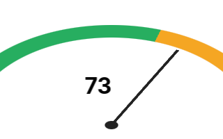
The demo reports Apollo 11's Command Module cabin pressure during the trans-lunar coast — ≈ 5.0 psi of pure O₂. NASA adopted the 5-psi standard after the Apollo 1 fire (Jan 1967) ruled out the original 14.7-psi atmosphere; everything above this nominal sits in the orange "caution" band, with the red fault zone at 8 psi.
Public surface
use wisp_chart::indicator::{Gauge, Zone};
use wisp_chart::color::Color;

let gauge = Gauge {
    value: 73.0,
    domain: (0.0, 100.0),
    zones: vec![
        Zone::new((0.0, 60.0),   Color::from_hex("#27ae60").unwrap()),
        Zone::new((60.0, 85.0),  Color::from_hex("#f5a623").unwrap()),
        Zone::new((85.0, 100.0), Color::from_hex("#e74c3c").unwrap()),
    ],
};

let g = gauge.emit_graphics(&theme, Vec2::new(240.0, 160.0));
let _ = stage.add_child(root, g);

let labels = gauge.emit_text_labels(&theme, Vec2::new(240.0, 160.0), &font);
for t in labels { let _ = stage.add_child(root, t); }
Angle convention
Domain min maps to angle π (left, 180°). Domain max maps to
angle 0 (right, 0°). Mid-domain is π/2 (top). Values
outside the domain are clamped before angle conversion.
| Value (% of domain) | Arc angle | Position |
|---|---|---|
| 0% | π (180°) | Left edge |
| 25% | 3π/4 | Upper-left |
| 50% | π/2 (90°) | Top |
| 75% | π/4 | Upper-right |
| 100% | 0 | Right edge |
Layout primitives
The renderer composes:
- Track — a neutral-grey full semicircle annular sector.
- Zones — one annular sector per zone, painted in order (later zones overlap earlier ones).
- Needle — a thin radial line from the gauge centre to the value's angle on the outer radius.
- Hub — a small filled circle at the pivot for visual completion.
All four use primitives that landed in
AUT-224's arc
support — no new geometry needed in wisp.
Theme integration
| Field | Drives |
|---|---|
theme.indicator.gauge_track_width_px | Band thickness |
theme.indicator.gauge_needle_color | Needle + hub colour |
theme.indicator.numeric_font_size | Centred value display |
theme.plot.gridline_minor.color | Track background colour |
Bullet chart
Stephen Few's compact performance-vs-target chart. A horizontal (or vertical) bar with three qualitative ranges painted behind it, a target marker line, and the current value as a thinner foreground bar.
The demo reports the 2005 DARPA Grand Challenge — Stanford's "Stanley" drove 132.2 mi across the Mojave (target: 132 mi) in 6 h 53 m to take the $2 M prize. The 2004 Challenge's best result was 7.4 mi; one year later five robots finished. The visible band just inside the target marker is the moment self- driving cars stepped off the slide deck.
Source: DARPA Grand Challenge (2005) — Wikipedia
Public surface
use wisp_chart::indicator::{Bullet, Orientation};

let bullet = Bullet {
    value: 270.0,
    target: 250.0,
    ranges: [150.0, 225.0, 300.0], // poor → ok → good thresholds
    orientation: Orientation::Horizontal,
};

let g = bullet.emit_graphics(&theme, Vec2::new(400.0, 80.0));
let _ = stage.add_child(root, g);
The five primitives
A bullet chart renders five primitives in this order:
- Poor band —
[0, ranges[0]], light grey - OK band —
[0, ranges[1]], medium grey (paints over poor) - Good band —
[0, ranges[2]], darker grey (paints over OK) - Value bar — thinner foreground bar from 0 to
value - Target line — vertical (or horizontal) marker at
target
Bands paint over each other because each spans from 0 to its
threshold. The visible bands are the differences: poor is the
portion before ranges[0], OK is the strip from ranges[0] to
ranges[1], good is the strip from ranges[1] to ranges[2].
Orientation
| Orientation | Use case |
|---|---|
Horizontal (default) | Dashboard rows, tight vertical packing |
Vertical | Sidebar KPIs, when label fits to the left |
Theme integration
| Field | Drives |
|---|---|
theme.indicator.bullet_poor_color | Poor (lowest) qualitative band |
theme.indicator.bullet_ok_color | Satisfactory (middle) band |
theme.indicator.bullet_good_color | Good (highest) band |
theme.indicator.bullet_value_color | Value bar fill |
theme.indicator.bullet_target_color | Target marker line |
Why bullet vs gauge
For one-shot dashboard tiles where vertical space is tight, bullet wins — it fits inside a row that already has a label and delta, while a gauge needs its own square aspect. Save gauges for the one hero metric that justifies the footprint.
Pie / donut chart
Categorical proportions of a whole — budget allocation, market share, traffic-source mix. Donut variant adds a centred hole.
Demo — Nightingale's mortality data, Crimean War 1854–55
The demo plots causes of British army mortality during the first winter of the Crimean War (April 1854 – March 1855): 83 % preventable disease, 8 % battle wounds, 9 % other. This is the dataset that became Florence Nightingale's famous polar-area "coxcomb" diagram — the chart that drove sanitary reform across military hospitals and made the case for hygiene-as-public-health.
Source: Florence Nightingale — Wikipedia
Public surface
use wisp_chart::polar::{Pie, Slice};
use wisp_chart::color::Color;

let pie = Pie::new(vec![
    Slice::new(45.0, "Organic",  Color::from_hex("#0072b2").unwrap()),
    Slice::new(25.0, "Paid",     Color::from_hex("#d55e00").unwrap()),
    Slice::new(15.0, "Social",   Color::from_hex("#009e73").unwrap()),
    Slice::new(10.0, "Referral", Color::from_hex("#cc79a7").unwrap()),
    Slice::new(5.0,  "Direct",   Color::from_hex("#f0e442").unwrap()),
]);
let g = pie.emit_graphics(&theme, Vec2::new(320.0, 320.0));
Donut variant
let donut = Pie::new(slices).hollow_ratio(0.5);hollow_ratio is clamped to [0, 0.95]. 0.0 = pie. Common
donut hole values are 0.4 – 0.6 (typical brand donuts) or
0.7+ (thin ring).
Layout
Slices render in input order, winding CCW from the +x axis
(3 o'clock). Each slice's angular span is value / total * 2π.
The pie centre sits at the centre of viewport_px; outer
radius is min(width, height) * 0.45.
Caveats
Pie charts are perceptually unreliable for comparing slices that aren't dramatically different in size — readers can't estimate angle ratios well. Prefer a bar chart when the ranking of values matters.
Sunburst chart
Radial hierarchical layout — root at the centre, each depth radiates outward as a concentric ring. Child segments span the angular range of their parent.
The demo decomposes the Apollo program's $25.4 B lifetime cost (1973 dollars) by NASA centre and then by program element. The inner ring groups the four big centres (Marshall → Saturn V, Manned Spacecraft Center → CSM + LM, Kennedy → launch + tracking, HQ → R&D + ops); the outer ring breaks each group into its program-element line items. Marshall's Saturn V slice alone is 36 % of the whole pie — the most expensive single machine ever built.
Source: Apollo program — Costs — Wikipedia
Public surface
use wisp_chart::polar::{Sunburst, SunburstNode};
use wisp_chart::color::Color;

let c = |hex| Color::from_hex(hex).unwrap();
let s = Sunburst::new(SunburstNode::group("root", c("#888"), vec![
    SunburstNode::group("Sales", c("#0072b2"), vec![
        SunburstNode::leaf("NA",   30.0, c("#56b4e9")),
        SunburstNode::leaf("EU",   20.0, c("#7faedc")),
        SunburstNode::leaf("APAC", 15.0, c("#a3c7ea")),
    ]),
    SunburstNode::group("Eng", c("#009e73"), vec![
        SunburstNode::leaf("Platform", 25.0, c("#3eb893")),
        SunburstNode::leaf("App",      20.0, c("#71cba8")),
    ]),
]))
.ring_width_px(30.0);
let g = s.emit_graphics(&theme, Vec2::new(320.0, 320.0));
Layout
Depth 0 (the root) is NOT drawn — only its descendants. Depth 1
is the inner ring. Each child's angular span is
child_weight / parent_weight * parent_span. Leaf weights are
the supplied value; internal-node weights are computed as the
sum of descendant leaves.
When sunburst beats treemap
Sunburst is the right call when depth matters more than area precision. Reading a 4-level hierarchy is easier in concentric rings than in nested rectangles because the rings give visual isolation. Use treemap when leaf-area proportions are the primary read.
Radar / spider chart
Multi-axis polygon overlay for multivariate comparison. Each entity becomes one polygon; vertices land on the per-axis value projected onto a polar coord system.
The demo plots the 1960 Rome Olympics medal table: USA vs USSR across five categories (gold / silver / bronze / track-and- field medals / total). 1960 was the first Summer Games the USSR topped the table at — the kickoff of the Cold War medal rivalry that ran through the 1988 Seoul boycott. The visible gap on the Total spoke shows the USSR's 32-medal margin.
Source: 1960 Summer Olympics medal table — Wikipedia
Public surface
use wisp_chart::polar::{Radar, RadarAxis, RadarSeries};
use wisp_chart::color::Color;

let r = Radar::new(
    vec![
        RadarAxis::new("speed",       (0.0, 100.0)),
        RadarAxis::new("range",       (0.0, 100.0)),
        RadarAxis::new("comfort",     (0.0, 100.0)),
        RadarAxis::new("efficiency",  (0.0, 100.0)),
        RadarAxis::new("price",       (0.0, 100.0)),
    ],
    vec![
        RadarSeries::new("Model A", vec![80.0, 70.0, 60.0, 90.0, 50.0], Color::from_hex("#0072b2").unwrap()),
        RadarSeries::new("Model B", vec![60.0, 85.0, 80.0, 70.0, 75.0], Color::from_hex("#d55e00").unwrap()),
    ],
);
Layout
Axes are placed at evenly-spaced angles starting at the top
(+π/2), winding CCW. Each axis has its own (min, max)
domain so heterogeneous units can share the chart.
Concentric polygon gridlines at 25%, 50%, 75%, 100% reference
the scale.
Convex caveat
wisp's draw_polygon is convex-only in v1 (fan triangulation).
Radar polygons are always star-convex from the centre, so
the fan from vertex 0 still renders correctly. If you generate
the input vertices another way (custom order, non-star-shaped),
expect visible triangle artifacts.
Best uses
Radar reads best for 3–6 axes and 2–4 series. Beyond that the polygon overlap turns into visual noise. For high-dimensional comparisons use a parallel-coordinates plot instead.
Polar coordinate plot
Charts where angle has meaning — wind direction, compass bearing, time-of-day distributions. v1 ships a wind-rose-style polar bar variant: concentric grid + radial spokes + one filled sector per category, sized to its value.
The demo plots Florence Nightingale's monthly disease deaths in the British Army during the Crimean War, April–November 1854 — the per-month breakdown behind her famous coxcomb diagram in Notes on Matters Affecting the Health, Efficiency, and Hospital Administration of the British Army (1858). The pie chapter shows the aggregate three-category summary; this polar view shows the same data sliced by month — the Sep–Nov peak driven by the Scutari hospital sanitation crisis stands out immediately.
Source: Florence Nightingale — Wikipedia
Public surface
use wisp_chart::polar::{PolarPlot, PolarCoord};
use wisp_chart::color::Color;

let plot = PolarPlot::new(
    vec!["N".into(), "NE".into(), "E".into(),  "SE".into(),
         "S".into(), "SW".into(), "W".into(),  "NW".into()],
    vec![12.0, 18.0, 22.0, 30.0, 25.0, 16.0, 14.0, 8.0],
);
let g = plot.emit_graphics(&theme, Vec2::new(320.0, 320.0));
Coord convention
The polar coord system is exposed via [PolarCoord] for callers
who want to compose their own primitives on a polar layout:
| Angle (rad) | Direction |
|---|---|
0 | Right (+x) |
π/2 | Top (-y screen) |
π | Left (-x) |
3π/2 | Bottom (+y screen) |
PolarCoord::to_pixel(θ, r ∈ [0, 1]) projects to pixel space:
(centre.x + r·cos θ, centre.y − r·sin θ). Screen +y is down,
so sin(θ) is negated to keep "0 = right, π/2 = top" reading.
Sector layout
Sectors start at angle π/2 (top — N on a compass) and go
clockwise through the category list. This matches compass
convention: N → NE → E → … → NW → back to N.
Beyond wind roses
For richer polar marks (lines, points, custom sectors), use
PolarCoord directly to convert your data to pixel positions
and emit wisp::Graphics primitives. The PolarPlot value
type is a ready-baked wind-rose; the coord system underneath is
general.
Related polar charts
For specific polar shapes that have their own constructors and chapter — read them first if your use case fits:
- Pie / donut — categorical proportions filling 2π.
- Sunburst — radial hierarchy across rings.
- Radar — multi-axis polygon overlay.
- Gauge — semicircle indicator with threshold zones.
Candlestick chart
OHLC price per period rendered as a body (open → close) with a thin wick spanning the period high → low.
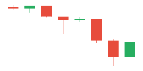
The demo plots the Dow Jones Industrial Average around the Wall Street Crash of 1929 — eight trading days from Mon Oct 21 through Wed Oct 30 1929, spanning Black Thursday (Oct 24), Black Monday (Oct 28), and Black Tuesday (Oct 29). The Oct 28 candle's body is the day the Dow lost 13 % in a single session; Oct 29 cut another 12 %, then a partial recovery on the 30th set the tone for the Great Depression to come.
Source: Wall Street Crash of 1929 — Wikipedia
Public surface
use wisp_chart::finance::{Candlestick, Period};

let c = Candlestick::new(vec![
    Period::new(100.0, 110.0, 95.0, 108.0),
    Period::new(108.0, 115.0, 105.0, 102.0),
    /* ... */
]);
let g = c.emit_graphics(&theme, Vec2::new(480.0, 240.0));Up periods (close >= open) use up_color (green default);
down periods use down_color (red default). Override before
emission for brand colours.
Why not a Plot mark
Period { open, high, low, close } doesn't fit the
(X, Y, Color) channel model of the Plot facade —
it's 4 numeric fields per row. Candlestick / OHLC / waterfall
ship as self-contained value types under wisp_chart::finance
instead.
OHLC bar chart
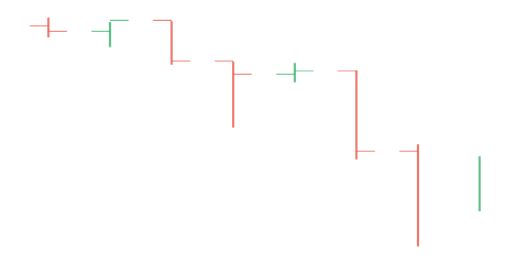
Pre-candlestick OHLC visualisation. A thin vertical line for the period range with two small horizontal ticks — left = open, right = close. More compact than candles for dense charts; preferred by some traders.
The demo plots the same dataset as the candlestick chapter: the Dow Jones across the Wall Street Crash of 1929 (Oct 21–30, including the three Black days). The OHLC encoding makes the open / close ticks easier to compare across consecutive sessions when range spans are large.
Source: Wall Street Crash of 1929 — Wikipedia
Public surface
use wisp_chart::finance::{Ohlc, Period};

let o = Ohlc::new(vec![
    Period::new(100.0, 110.0, 95.0, 108.0),
    /* ... */
]);
let g = o.emit_graphics(&theme, Vec2::new(480.0, 240.0));
Tick length is tick_length_fraction × band_width (default 0.3).
Waterfall chart
Show how a starting value evolves through a sequence of positive / negative contributions to a final value — revenue waterfall (revenue → costs → margin), budget decomposition, P&L bridges.
The demo decomposes the Apollo program's $25.4 B lifetime cost (1973 closeout, in 1973 dollars) by the four big spending buckets: the Saturn V rocket family, the Apollo CSM + Lunar Module spacecraft, ground operations + tracking, and the rest of the R&D portfolio. Saturn V alone — Wernher von Braun's moon rocket — was 36 % of the program total.
Source: Apollo program — Costs — Wikipedia
Public surface
use wisp_chart::finance::{Waterfall, WaterfallRow};

let w = Waterfall::new(vec![
    WaterfallRow::summary("Start",   100.0),
    WaterfallRow::contribution("Revenue",  80.0),
    WaterfallRow::contribution("COGS",    -30.0),
    WaterfallRow::contribution("Opex",    -25.0),
    WaterfallRow::contribution("Tax",     -10.0),
    WaterfallRow::summary("End",     115.0),
]);
Row kinds
| Constructor | Visual |
|---|---|
WaterfallRow::summary(label, v) | Full-height bar from 0 to v — typically Start / End totals |
WaterfallRow::contribution(label, d) | Floating bar sitting on the running total, length |d|, coloured by sign |
Positive contributions use positive_color (green default).
Negative contributions use negative_color (red default).
Summary bars use summary_color (blue default).
Baseline chart
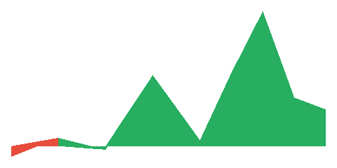
Area chart split by a horizontal reference line — fill above the baseline in one colour (profit), below in another (loss). Common for diff series, deviation-from-target, gains-vs-losses.
The demo plots the US Federal Funds Rate, 1965–1985, baselined against the long-run 5 % anchor most macro texts use when discussing the Volcker disinflation. The visible spikes above the baseline track the late-60s Vietnam-era overheating, the post-oil-shock inflation, and the Volcker shock of 1979–82 that crushed double-digit inflation by taking the funds rate above 16 % — a peak you can read straight off the 1981 fill.
Source: Federal funds rate — Wikipedia
Public surface
use wisp_chart::baseline::BaselineChart;

let bc = BaselineChart::new(
    vec![(0.0, 10.0), (1.0, 25.0), (2.0, -10.0), (3.0, 15.0)],
    0.0, // baseline y-value
);
let g = bc.emit_graphics(&theme, Vec2::new(480.0, 240.0));
Per-segment colouring
Each segment between consecutive points is coloured by the sign of the average y of its endpoints relative to the baseline. Segments that cross the baseline currently render with the average-side colour — a future refinement could split the segment at the crossing point for exact colouring.
Table heatmap
Show a 2D matrix of values — confusion matrices, hour×day activity, regional×product sales. Colour intensity replaces explicit numeric labels for fast pattern recognition.
The demo plots weekly excess-mortality rate (per 1 000) during the 1918 influenza pandemic across five US cities × eight weeks (late Sep – mid-Nov). Cities that imposed early NPIs — school closures, public-gathering bans — cap visibly lower than cities that delayed; Philadelphia's catastrophic week-4 peak followed its decision to allow a 200 000-person Liberty Loan parade on Sep 28. The data anchors Markel et al.'s 2007 JAMA analysis of NPI effectiveness.
Source: 1918 flu pandemic in the United States — Wikipedia
Public surface
use wisp_chart::heatmap::{TableHeatmap, SequentialPalette};

let h = TableHeatmap::new(
    vec!["Mon".into(), "Tue".into(), "Wed".into()],
    vec!["00h".into(), "06h".into(), "12h".into(), "18h".into()],
    vec![
        vec![ 5.0, 20.0, 40.0, 18.0],
        vec![ 8.0, 25.0, 50.0, 22.0],
        vec![10.0, 30.0, 55.0, 24.0],
    ],
).palette(SequentialPalette::blues());
let g = h.emit_graphics(&theme, Vec2::new(400.0, 240.0));
Palette options
| Palette | Use case |
|---|---|
SequentialPalette::blues() | Default — single-hue magnitude |
SequentialPalette::magma() | Heat / intensity reads |
SequentialPalette::github() | Discrete-level contribution graphs |
SequentialPalette::new(stops) | Custom palette from your colours |
Each cell's colour is palette.sample((value - lo) / (hi - lo))
where (lo, hi) is the matrix's numeric extent. Linear
interpolation between adjacent palette stops.
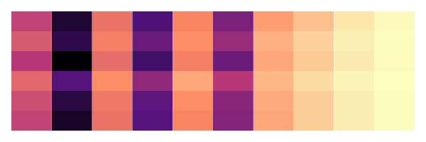
Calendar / annual heatmap
GitHub-style contribution graph or year-in-review heatmap — one cell per day, 7 rows × 53 columns, colour intensity reflects daily value.
The demo plots weekly excess-mortality from influenza + pneumonia in NYC across 1918 — the year the Spanish flu killed more Americans than World War I, World War II, the Korean War, and the Vietnam War combined. The lighter March / April band is the "first wave"; the saturated October cluster is the catastrophic autumn second wave that peaked at ~13 weekly deaths per 10 k population.
Source: 1918 flu pandemic in the United States — Wikipedia
Public surface
use wisp_chart::heatmap::{CalendarHeatmap, CalendarValue, SequentialPalette};
use jiff::civil::date;

let cal = CalendarHeatmap::new(2025, vec![
    CalendarValue::new(date(2025, 1, 15),  5.0),
    CalendarValue::new(date(2025, 6, 1),  12.0),
    /* ... */
])
.palette(SequentialPalette::github());
let g = cal.emit_graphics(&theme, Vec2::new(720.0, 120.0));
Layout
Columns are ISO weeks (1..52, occasionally 53 for leap years).
Rows are weekdays — Monday at row 0, Sunday at row 6. Days with
no entry render at the palette's 0.0 stop. Values from other
years are silently ignored so reusing a multi-year dataset
across multiple heatmaps is safe.
Date math via jiff
wisp-chart depends on jiff for date /
weekday / ISO-week math. jiff is scoped to this crate's
Cargo.toml so wisp itself stays date-free.
Lasagna plot
Pack many entity-time series into a single "lasagna" of horizontal heatmap rows — one entity per row, time across columns, colour shows value. Reads patterns across hundreds of entities that a multi-line chart spaghettis up.
The demo plots US polio incidence per 100 k population by state × half-year, 1952 → 1956. The Salk inactivated polio vaccine was approved 12 Apr 1955 and rolled out nationally that spring; every state's incidence collapses to near-zero in the two columns after the vaccine launch. The "before / after" contrast is the visual evidence that anchored the global eradication effort.
Source: Polio vaccine — Wikipedia
Public surface
use wisp_chart::heatmap::{LasagnaHeatmap, SequentialPalette};

let l = LasagnaHeatmap::new(
    vec!["entity-1".into(), "entity-2".into(), /* ... */],
    (0..24).map(|h| format!("{h:02}h")).collect(),
    vec![
        vec![/* 24 values */],
        vec![/* ... */],
    ],
).palette(SequentialPalette::magma());Cells render flush — no gap — which is what makes a lasagna "lasagna" rather than a table heatmap. The continuous stripe lets the eye scan an entity's trajectory across time without inter-cell scaffolding.
2D histogram (binned heatmap)
Bin a 2D point cloud into a fixed grid and emit one filled cell per bin, coloured by count. Useful when a scatterplot over-plots so heavily that individual points stop being legible.
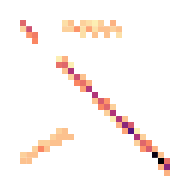
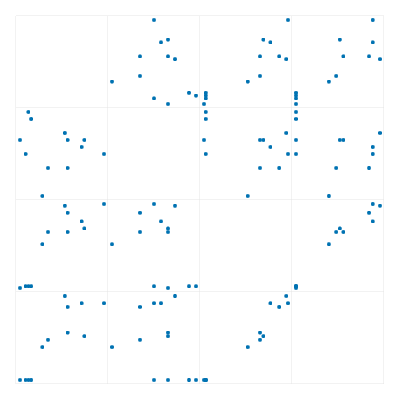
The demo plots the Hertzsprung–Russell diagram — stellar effective temperature (log K, X) against absolute magnitude (M_V, Y, brighter up) for ~640 synthesised stars. The dense diagonal running top-right → bottom-left is the main sequence; the cluster top-left is white dwarfs; the upper-right scatter is red giants + supergiants. The chart was published independently by Hertzsprung (1911) and Russell (1913) and is the single most important diagram in stellar astrophysics.
Source: Hertzsprung–Russell diagram — Wikipedia
Public surface
use wisp_chart::heatmap::Histogram2D;

let points: Vec<(f32, f32)> = collect_xy_observations();
let h2 = Histogram2D::from_points(
    &points,
    /* cols */ 24,
    /* rows */ 24,
    Some(((-5.0, 5.0), (-5.0, 5.0))),  // optional clipping extent
);
let g = h2.emit_graphics(&theme, viewport);Choose 2D-histogram when:
- N ≳ 10k points (over-plotted scatter).
- You want density-readable colour-encoding rather than shape-encoding.
- Outliers are less important than the bulk distribution.
Choose scatter when individual points matter (small N, outlier hunting, labelled-point overlays).
Treemap
Show hierarchical proportions by area — directory sizes, budget breakdown, taxonomic counts. Each node is a rectangle sized to its value; children pack inside their parent's rectangle.
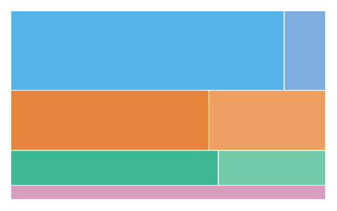
The demo squarifies the Apollo program $25.4 B cost hierarchy — same data as the sunburst chart, different geometry. The Saturn V leaf claims the largest rectangle in the plot; CSM + LM share the second-biggest group; ground ops and R&D fill the remainder. The treemap's strength is that area ratios are directly comparable across nesting levels — the Saturn V's rectangle is genuinely 5× the size of the LM's because $9.3 B is 5× $3.0 B.
Source: Apollo program — Costs — Wikipedia
Public surface
use wisp_chart::topology::{Treemap, TreemapNode};
use wisp_chart::color::Color;

let c = |hex| Color::from_hex(hex).unwrap();
let t = Treemap::new(TreemapNode::group("root", c("#888888"), vec![
    TreemapNode::group("Sales", c("#0072b2"), vec![
        TreemapNode::leaf("NA",   30.0, c("#56b4e9")),
        TreemapNode::leaf("EU",   20.0, c("#7faedc")),
    ]),
    TreemapNode::group("Eng", c("#d55e00"), vec![
        TreemapNode::leaf("Platform", 25.0, c("#e8853d")),
        TreemapNode::leaf("App",      18.0, c("#eea063")),
    ]),
]));
let g = t.emit_graphics(&theme, Vec2::new(480.0, 300.0));
Layout — slice-and-dice (v1)
v1 uses slice-and-dice: even-depth nodes split vertically (rows stacked top-down), odd-depth nodes split horizontally (columns stacked left-to-right). Predictable, pixel-stable, dependency-free.
Slice-and-dice produces visually weaker rectangles for wildly imbalanced trees (long thin strips) than squarify. Squarify support is a follow-on; today's layout is "good enough" for most product-data hierarchies.
Funnel chart
Staged conversion / loss visualisation. Each stage is a horizontal band; band width reflects remaining count relative to the widest stage.
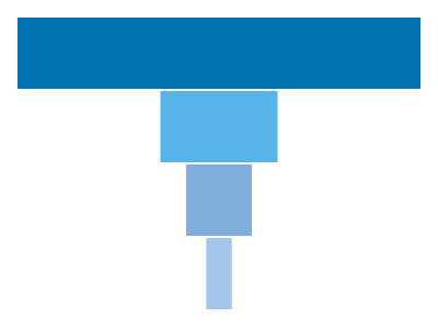
The demo plots NASA's Mercury Seven astronaut selection, 1958–59: 508 military test pilots invited → 110 records- reviewed → 32 screened at the Lovelace Clinic + Wright-Patterson AFB → 18 finalists → 7 selected on 9 April 1959. The narrowest funnel in spaceflight history.
Source: Mercury Seven — Wikipedia
Public surface
use wisp_chart::topology::{Funnel, FunnelStage};
use wisp_chart::color::Color;

let c = |hex| Color::from_hex(hex).unwrap();
let f = Funnel::new(vec![
    FunnelStage::new("Visited",   10000.0, c("#0072b2")),
    FunnelStage::new("Signed up",  4000.0, c("#56b4e9")),
    FunnelStage::new("Activated",  1800.0, c("#7faedc")),
    FunnelStage::new("Converted",   600.0, c("#a3c7ea")),
]);
let g = f.emit_graphics(&theme, Vec2::new(400.0, 300.0));Each band is horizontally centred — width = count / max_count × plot_width. The drop-off between adjacent bands shows where
the biggest losses happen, which is usually what the reader
cares about.
Sankey flow diagram
Show flows between nodes laid out in columns — sources on the left, sinks on the right, intermediate nodes in between. Ribbon thickness encodes flow magnitude. Useful for conversion funnels, budget allocation, energy flow, attribution.
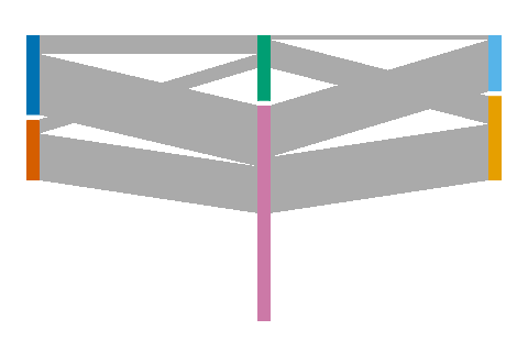
The demo plots the NASA astronaut career flow, Groups 1–3 (Mercury / Gemini / Apollo eras). ~30 astronauts; sources on the left are the service branches they came from (USAF, Navy / USMC); the middle column groups them by training cohort (Mercury or Gemini); the right shows the ultimate Apollo outcome (Walked on Moon vs Did not). Twelve astronauts ultimately walked on the Moon — the right-hand ribbon converging into that node is the visible bottom-line of the whole program.
Source: NASA Astronaut Group 1 — Wikipedia
Public surface
use wisp_chart::topology::{Sankey, SankeyLink, SankeyNode};

let nodes = vec![
    SankeyNode::new("Organic",   /* column */ 0, blue),
    SankeyNode::new("Paid",      0, orange),
    SankeyNode::new("Signed Up", 1, green),
    SankeyNode::new("Trial",     1, pink),
    SankeyNode::new("Converted", 2, sky),
    SankeyNode::new("Lost",      2, gold),
];
let links = vec![
    SankeyLink::new(0, 2, 40.0, grey),
    SankeyLink::new(0, 3, 25.0, grey),
    // ...
];
let s = Sankey::new(nodes, links);
let g = s.emit_graphics(&theme, viewport);v1 uses a column-based layout: every node names its column explicitly, link Y-positions stack within each column in declaration order, and ribbon ribbons are drawn as convex quads (not Bezier curves). Quads are visually noisier than Beziers at crossings but are deterministic, cheap, and easy to test — appropriate for v1.
- Conversion / funnel narratives where you also want to show the lost flow at each step.
- Budget allocation between fixed buckets.
- "Where does this come from / where does it go" — anything with a clear flow direction.
For a strictly-stepped conversion without crossings, funnel is the simpler shape.
Box plot
Five-number summary of a distribution per category — min / Q1 / median / Q3 / max. Side-by-side boxes compare distributions across categories.
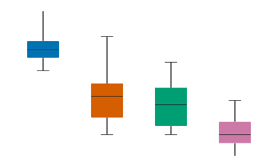
The demo plots Boston Marathon men's winning times by decade (1900s through 1960s), in minutes. The marathon began in 1897 as the second-oldest marathon worldwide; each box summarises the per-decade spread of the winning time. The progression from a 158-min median in the 1900s to 138 min in the 1960s tracks training science + course modernisation; the wide 1920s box is the pre-pace-strategy era where race tactics were still being invented. Source: Wikipedia "List of Boston Marathon winners".
Source: List of Boston Marathon winners — Wikipedia
Public surface
use wisp_chart::distributions::{BoxPlot, Box};
use wisp_chart::color::Color;

// From precomputed quartiles:
let bp = BoxPlot::new(vec![
    Box::from_summary("A", 10.0, 20.0, 30.0, 45.0, 60.0, Color::from_hex("#0072b2").unwrap()),
    /* ... */
]);

// Or from raw samples:
let samples: Vec<f32> = /* … */;
let bx = Box::from_samples("ints", &samples, Color::from_hex("#d55e00").unwrap()).unwrap();from_samples uses the inclusive-method percentile lookup —
samples[((n-1) × p) as usize] after sorting. Good for a quick
exploration; for publication-grade quartiles compute them
upstream (e.g. with statrs) and call from_summary.
Per-box primitives
Each box emits 6 primitives: 1 filled rect (Q1→Q3), 1 median line, 2 whiskers (min→Q1 + Q3→max), 2 whisker caps. A 4-box plot is 24 primitives total.
Parallel coordinates plot
Explore multivariate datasets (4–12 dimensions) by drawing one polyline per row across parallel vertical axes — each axis normalised to its own domain. Patterns (clusters, outliers, anti-correlated dimensions) emerge from polyline shapes.
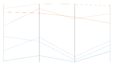
The demo plots the six Apollo crewed lunar missions (11 / 12 / 14 / 15 / 16 / 17) across four mission dimensions: total mission duration (days), surface EVA hours, kilometres traversed on the Moon, and sample mass returned (kg). The visible "step up" between Apollo 14 and Apollo 15 is the Lunar Roving Vehicle's first deployment — every dimension jumps together because once astronauts could drive, every mission profile expanded.
Source: Apollo program — Lunar missions — Wikipedia
Public surface
use wisp_chart::distributions::{ParallelCoords, ParallelAxis, ParallelRow};
use wisp_chart::color::Color;

let c = |hex| Color::from_hex(hex).unwrap();
let pc = ParallelCoords::new(
    vec![
        ParallelAxis::new("mpg", (10.0, 50.0)),
        ParallelAxis::new("cyl", ( 3.0,  8.0)),
        ParallelAxis::new("hp",  (60.0, 300.0)),
        ParallelAxis::new("wt",  ( 1.5,   5.5)),
    ],
    vec![
        ParallelRow::new(vec![32.0, 4.0,  95.0, 2.2], c("#0072b2")),
        ParallelRow::new(vec![14.0, 8.0, 280.0, 4.4], c("#009e73")),
        /* ... */
    ],
);Each axis carries its own (min, max) domain so heterogeneous
units share the chart cleanly. Values are clamped to [0, 1]
of their axis before pixel mapping.
Visual reads
Crossing patterns: lines that cross between two adjacent axes signal negative correlation. Lines that stay parallel signal positive correlation. Clusters: bundles of lines following a common shape across most axes indicate sub-groups worth investigating with a more pointed chart (scatter, box).
Error bars overlay
Show measurement uncertainty alongside a central tendency — confidence intervals on a bar chart, standard errors on a scatter, fixed-value error bars on a measurement series. Lifts a chart from "looks confident" to "is honest about uncertainty".
The demo plots Robert Millikan's published electron-charge values from the oil-drop experiment, 1909 → 1913, with the uncertainty bands he reported each year. Millikan's 1913 figure of 4.774 × 10⁻¹⁰ statcoulomb won him the 1923 Nobel and held as the canonical value until later re-analyses. The visible year-to-year drift — bars that don't overlap one another's intervals as you'd expect them to — is the cautionary tale Richard Feynman cited in Cargo Cult Science: error bars don't include systematic bias.
Source: Oil drop experiment — Wikipedia
Public surface
use wisp_chart::overlay::{ErrorBars, ErrorPoint, ErrorKind};
use wisp_chart::plot::{self, Mark, Plot, ScaleKind};
use wisp::math::Rect;

// 1. Render the primary chart (Bar, Point, Line — anything cartesian).
let bar = Plot::new(rows)
    .mark(Mark::Bar { value_labels: false })
    .encode(plot::x("quarter", ScaleKind::Band))
    .encode(plot::y("revenue", ScaleKind::Linear));
let bar_g = bar.render(&theme, viewport);
let _ = stage.add_child(root, bar_g);

// 2. Build the error-bars overlay with one entry per primary mark.
//    `x_fraction` is the position along the plot's x extent (0..1).
let bars = ErrorBars::new(
    vec![
        ErrorPoint::symmetric(0.125, 38.0, 5.0),
        ErrorPoint::symmetric(0.375, 52.0, 7.0),
        ErrorPoint::symmetric(0.625, 47.0, 6.0),
        ErrorPoint::symmetric(0.875, 64.0, 9.0),
    ],
    (0.0, 64.0), // Y domain matching the bar chart
);

// 3. Overlay using the SAME plot rect so whiskers land on bar centres.
let plot_rect = Rect::new(60.0, 40.0, viewport.x - 80.0, viewport.y - 80.0);
let overlay = bars.emit_graphics_in_rect(&theme, viewport, plot_rect);
let _ = stage.add_child(root, overlay);
Three error kinds
[ErrorKind] documents the three input flavours ErrorPoint
helpers convert into the absolute (lower, upper) representation
used at render time:
Symmetric(half_width)— standard deviation or±huncertainty. Helper:ErrorPoint::symmetric(x_fraction, mean, half_width).Asymmetric { lower, upper }— skewed distributions, quantile intervals. Helper:ErrorPoint::asymmetric(x_fraction, mean, below, above).ConfidenceInterval(half_width)— caller pre-multiplies the standard error by the z-score (1.96 × SEfor a 95% CI). The enum carries the half-width; the caller does the stats.
Plot-rect alignment
The most common slip-up is calling
[ErrorBars::emit_graphics] (16-px pad default) when overlaying
on a Plot::Bar chart, which uses a 60-px gutter + 40-px header
/ footer. The whiskers land off-centre. Always use
[ErrorBars::emit_graphics_in_rect] with the underlying
chart's plot rectangle — for a default Plot bar chart that's
Rect::new(60.0, 40.0, viewport.x - 80.0, viewport.y - 80.0).
Why this is an overlay, not a mark
v1 ships ErrorBars as a self-contained value type rather than
a Mark::ErrorBar variant on the Plot facade. The
overlay use case spans multiple mark families (bar / point /
line / box) and doesn't fit cleanly into the (X, Y, Color)
channel model — the per-point lower/upper are extra dimensions.
A future ticket can add Plot::overlay(ErrorBars) once enough
real callers settle on a common ergonomic shape.
Histogram
Bin a sample of scalar observations into equal-width buckets and
emit one bar per bin. The default binning rule is the square-root
rule (⌈√n⌉); pass BinCount::Fixed(n) for a fixed bin count.
The demo plots heights of Union Army recruits, c. 1864, drawn from Benjamin A. Gould's 1869 Investigations in the Military and Anthropological Statistics of American Soldiers — the largest systematic anthropometric study of the 19th century. The distribution centres on 67.8 in (~172 cm) with σ ≈ 2.5 in, the Gaussian fit Gould reported for the 25–34 age bracket, and later anchored Galton's work on regression to the mean.
Source: Anthropometric history — Wikipedia
Public surface
use wisp_chart::distributions::{BinCount, Histogram};

let samples: Vec<f32> = collect_observations();
let hist = Histogram::from_samples(
    &samples,
    BinCount::Auto,           // sqrt-rule
    Some((0.0, 100.0)),       // optional clamping extent
);
let g = hist.emit_graphics(&theme, Vec2::new(360.0, 240.0));BinCount::Auto—⌈√n⌉bins. Cheap, robust, biased toward over-binning for very large samples.BinCount::Fixed(k)— explicit bin count. Use when comparing multiple histograms side-by-side so the bars line up.
A histogram shows you exactly which observations landed where — useful for outlier hunting and reading off exact counts. A KDE shows you the underlying density estimate — useful when the bin-edge choice would distort the story. They compose; some teams ship both stacked.
Density (KDE)
Kernel-density estimate over a 1D sample. Smooths the discrete histogram into a continuous density curve. Defaults to a Gaussian kernel + Silverman's rule of thumb for the bandwidth.
The demo uses the same dataset as the histogram chapter — heights of Union Army recruits, c. 1864 (Gould's 1869 Statistics of American Soldiers). The smoothed density makes it obvious that the binned heights are essentially Gaussian around 67.8 in; the bandwidth choice controls how aggressively adjacent bins blur into one another.
Source: Anthropometric history — Wikipedia
Public surface
use wisp_chart::distributions::{BandwidthRule, KdePlot};

let kde = KdePlot::new(samples)
    .bandwidth(BandwidthRule::Silverman);    // or Manual(0.5)
let g = kde.emit_graphics(&theme, Vec2::new(360.0, 240.0));BandwidthRule::Silverman—1.06·σ·n^(-1/5). Robust default for unimodal data. Mildly over-smooths bimodal distributions.BandwidthRule::Manual(h)— pick your own. Useful for reproducing a published figure with a known bandwidth.
Render one KDE per category by repeating this fixture inside the trellis / small-multiples layout. Same value type, different containing layout — the faceted-density chapter walks through it.
Faceted density
A composition pattern, not a separate value type. Render one KDE per facet (category, time window, group) inside the trellis small-multiples layout — same data shape, repeated per facet.
The single-facet demo below reuses the KDE chapter's Civil War recruit-height dataset (Gould 1869). A genuine faceted build would render one panel per recruit-age bracket (e.g. 18-21 / 22-25 / 26-29 / 30-34) so the reader could compare the distribution shape across cohorts at a glance.
Source: Anthropometric history — Wikipedia
Pattern
use wisp_chart::distributions::KdePlot;
use wisp_chart::multi::Trellis;

let facets: Vec<KdePlot> = groups
    .iter()
    .map(|group| KdePlot::new(group.samples.clone()))
    .collect();

let trellis = Trellis::new(facets, /* cols */ 3, /* gap_px */ 16.0);
let g = trellis.emit_graphics(&theme, viewport);Overlaying many KDEs on one axis is legible up to ~5 series. Past that, the eye loses which curve is which even with distinct colours. Faceting trades axis-comparison ease for "each facet reads cleanly" — the right choice for >5 groups.
If n series fit in cols × ⌈n/cols⌉ facets with cols ≈ √n,
the aspect ratio of the grid stays close to 1:1. The
trellis chapter has the full layout recipe.
Ternary plot
Plot 3-component compositional data on an equilateral triangle. Each point's position uniquely encodes all three component ratios; constructors normalise so the components sum to 1. The classic use case is soil composition (sand / silt / clay) but ternary diagrams turn up everywhere portfolios sum to a constant.
The demo plots eight reference points from the USDA soil-texture triangle — sand at the bottom-left vertex, silt at bottom-right, clay at the top. The points span the canonical texture classes (sand, sandy loam, loam at the visual centre, silty clay loam, clay…) — the same classification agronomists have used since the Soil Survey Manual published the diagram in 1951.
Source: Soil texture — Wikipedia
Public surface
use wisp_chart::ternary::{TernaryPlot, TernaryPoint};

let points = vec![
    TernaryPoint::new(0.5, 0.3, 0.2, color),
    TernaryPoint::new(0.2, 0.3, 0.5, color),
    // ...
];
let plot = TernaryPlot::new("Sand", "Silt", "Clay", points);
let g = plot.emit_graphics(&theme, Vec2::new(360.0, 360.0));For triangle vertices A (bottom-left), B (bottom-right), C
(top), a point with normalised components (a, b, c) lands at
a·A + b·B + c·C. v1 draws the triangle outline, internal grid
lines at 25 / 50 / 75 %, and one ellipse per point.
- Three categories must sum to a fixed total (percentages, composition, portfolio weights).
- Comparing many compositions at once — the triangle reveals clustering that a stacked-bar over time would hide.
- Sediment / petrology / metallurgy — the textbook home of ternary diagrams.
Contour plot
Draw iso-level contours over a 2D scalar field using marching squares. Useful for topology, terrain, response surfaces, and 2D density visualisations where the lines themselves are the feature.
The demo draws the bivariate normal density Sir Francis Galton popularised in his 1885 quincunx + regression-board demonstration — a single radial Gaussian peak with five nested iso-density contours. The same shape underlies modern density estimation and 2D KDEs.
Source: Galton board — Wikipedia
Public surface
use wisp_chart::contour::ContourPlot;

let field: Vec<f32> = sample_function_on_grid();  // rows × cols
let plot = ContourPlot::new(
    field,
    /* cols */ 48,
    /* rows */ 48,
    vec![0.15, 0.35, 0.55, 0.75, 0.9],   // iso-levels
);
let g = plot.emit_graphics(&theme, viewport);Each grid cell's four corners are compared to the iso-level
threshold; the 16 possible above/below sign-bit combinations map
to 16 line-segment cases. The implementation is a flat match —
no degenerate ambiguities are smoothed (saddle points pick a
fixed orientation), which keeps the output deterministic across
runs and platforms.
- A 2D histogram or table heatmap shows the bulk of the field via colour — easy to read overall shape.
- A contour plot shows specific levels — easy to read "everything above 0.75 is here". Compose both: filled heatmap underneath, contour lines on top.
Trellis / small multiples
Tile a grid of mini sub-plots — one chart per category in a row / column / grid layout. Tufte's small multiples.
Public surface
use wisp_chart::multi::{Trellis, TrellisCell};

// 1. Decide grid dimensions.
let trellis = Trellis::new(2, 3, Vec::new());
let cell_viewport = trellis.cell_viewport_px(Vec2::new(600.0, 360.0));

// 2. Build per-cell Graphics at `cell_viewport` sizing.
let mut cells = Vec::new();
for label in ["Q1", "Q2", "Q3", "Q4", "Q5", "Q6"] {
    let plot = Plot::new(fixture_for(label))
        .axes(false)
        .mark(Mark::Bar { value_labels: false })
        .encode(plot::x("category", ScaleKind::Band))
        .encode(plot::y("value", ScaleKind::Linear));
    let g = plot.render(&theme, cell_viewport);
    cells.push(TrellisCell::new(label, g));
}
let trellis = Trellis::new(2, 3, cells);

// 3. Add positioned cells to the stage:
for g in trellis.positioned_cells(Vec2::new(600.0, 360.0)) {
    stage.add_child(root, g);
}
// 4. Add grid borders as a separate Graphics:
let borders = trellis.emit_grid_borders(&theme, Vec2::new(600.0, 360.0));
stage.add_child(root, borders);
Why v1 takes pre-built Graphics
A "true" faceting API would re-build each sub-chart from a filtered slice of the source DataFrame. That requires the chart to expose its render path through an interface — which is specific per chart family. v1 takes the simpler "caller builds the cell, we just tile" approach. The caller can use any chart type (bar / scatter / line / etc.) for each cell.
Cell sizing
The cell's Graphics must be built using
trellis.cell_viewport_px(outer) as its viewport so its NDC
range maps cleanly onto the cell rectangle. positioned_cells
applies translation + scale; if the cell was built against the
wrong viewport its content will be off-centre or clipped.
When to use trellis vs other multi-view options
| Use case | Pick |
|---|---|
| One chart per category | Trellis |
| Pairwise scatters of N dims | SPLOM |
| Many entities × time → colour grid | Lasagna |
| Layered axes on one chart | Multi-encoding Plot |
Scatterplot matrix (SPLOM)
Quickly survey all pairwise relationships in a multi-dimensional dataset — N variables produce an N×N grid where each cell is a scatter of the row's variable vs the column's.
The demo plots Fisher's Iris four flower measurements (sepal length, sepal width, petal length, petal width — all in centimetres) across 12 samples covering the three species. Inspect the bottom-left cell to see petal length × sepal length — the strongest single discriminator between species — and the top-right cell for the weakest (sepal width × any). This is the view Fisher's 1936 paper uses implicitly when arguing for linear discriminant analysis.
Source: Iris flower data set — Wikipedia
Public surface
use wisp_chart::multi::{Splom, SplomDimension};

let s = Splom::new(vec![
    SplomDimension::new("mpg", vec![32.0, 28.0, 22.0, 18.0, 14.0, 12.0]),
    SplomDimension::new("cyl", vec![ 4.0,  4.0,  6.0,  6.0,  8.0,  8.0]),
    SplomDimension::new("hp",  vec![95.0,110.0,150.0,200.0,280.0,300.0]),
    SplomDimension::new("wt",  vec![ 2.2,  2.5,  3.0,  3.6,  4.4,  5.0]),
]);
let g = s.emit_graphics(&theme, Vec2::new(400.0, 400.0));
Diagonal
v1 leaves the diagonal cells blank. A follow-on ticket replaces each diagonal with a small histogram (or density / KDE) of that single dimension. The off-diagonal mini-scatters are the primary read until then.
Sizing
SPLOM viewports want square aspect ratios so each cell is square — easier to compare angle and density across cells. 4- dimension SPLOM at 400×400 px gives 100×100 px cells, which is already a tight read; for 6+ dims aim for 600+ px on the long edge.
Gantt overview
The v1 Gantt is hyper-specific by design: one concrete API, one concrete fixture (a 2026 renderer roadmap), one concrete render target. Surface stays narrow until ergonomics force change.
Pieces
flowchart TD
    Data["Gantt { range, rows, bars, people }"]:::chart
    Theme["Theme::light() + Wong palette"]:::chart
    Layout["date → x · row → y · divider dates"]:::chart
    Render["wisp::Graphics + wisp::Text + wisp::Mask"]:::wisp
    Node["wisp::scene::Node"]:::wisp

    Data --> Layout
    Theme --> Layout
    Layout --> Render
    Render --> Node

    classDef chart fill:#312e81,stroke:#6366f1,color:#e0e7ff
    classDef wisp fill:#7c2d12,stroke:#ea580c,color:#fed7aa
Pixel-spec (v1, from AUT-180)
- Canvas: 1920 × 800 px.
- Left gutter (project labels, right-aligned): 180 px.
- Header band: 60 px (30 px month strip, 30 px week strip below).
- Row height: 44 px. Bar height: 28 px (vertically centred). 6 px corner radius.
- Background: white. Alt-row tint:
#fafafa. - Week grid:
#e5e5e5, 1 px. Month grid:#cccccc, 2 px. Month label sits above the week label. - Bar fill: owner colour (Wong palette, hash-assigned). Bar text: owner name, white or black auto-chosen for contrast.
Status today
- ✅ Data structs (
Gantt,Row,Bar,DateRange,PersonMap). - ✅ Theme + Wong palette + contrast util.
- ⏳ Layout math — placeholder module today; lands in chunk 2.
- ⏳
Gantt::render(&Theme) -> SceneNode— placeholder module today; lands in chunk 3.
Subsequent chapters fill in as the rendering passes ship.
Why hyper-specific first
Per AUT-180:
This is a purely presentational composition: data goes in, a scene-graph subtree comes out. The first chart we ship is hyper-specific by design: one concrete year, one concrete team, one concrete API, so the implementation has zero degrees of freedom before we iterate on flexibility.
Generalisation (bar / line / area) happens AFTER Gantt v1 has a stable internal shape — not before.
Gantt — data-struct API
v1 is data-struct only. No DSL, no parser, no builder. Future M-CHART.1 may add a builder if ergonomics demand it.
Top level
pub struct Gantt {
    pub range: DateRange,
    pub rows: Vec<Row>,
    pub bars: Vec<Bar>,
    pub people: PersonMap,
}
DateRange
Half-open [start, end). Two constructors:
DateRange::year(2026)                    // [Jan 1, Jan 1 of next year)
DateRange::from(date(2026, 2, 1)..date(2026, 3, 15))
The From<Range<Date>> impl makes inline construction
ergonomic in fixtures and tests.
Row
Row::new("vec", "M-VEC")id is the stable identifier; Bar::row_id references it.
label is the string drawn in the left gutter.
Bar
Bar::new(
    "vec",
    date(2026, 2, 1)..date(2026, 3, 15),
    "Matt",
)
Bar::label and Bar::group are Option<String> and default
to None. v1 stores group but does not render it.
PersonMap
let mut people = PersonMap::default();
people.insert(Person {
    name: "Matt".into(),
    color: Color::from_hex("#0072b2").unwrap(),
});
Explicit entries override the auto-assigned palette colour.
Owners without an entry fall back to Theme::palette
auto-assignment.
Serde
The data structs are intentionally serde-friendly — adding
#[derive(Serialize, Deserialize)] later is a one-line change
per struct. The first ingest format will be CSV (M-CHART.2 /
follow-on ticket).
API stability
The public surface is intentionally narrow. Additive changes
(more fields with Default impls, more constructors) ship at
minor versions. Renames / removals trip cargo semver-checks.
Theme + palette
The visual configuration applied at render time. Theme::light()
ships v1; dark + custom themes follow.
Defaults
Theme {
    bg: #ffffff,
    row_alt_bg: Some(#fafafa),
    grid_week: { color: #e5e5e5, width: 1.0 },
    grid_month: { color: #cccccc, width: 2.0 },
    header_bg: #f5f5f5,
    text_primary: #222222,
    text_muted: #888888,
    bar_corner_radius: 6.0,
    bar_height: 28.0,
    row_height: 44.0,
    gutter_width: 180.0,
    header_height: 60.0,
    palette: OwnerPalette::Wong,
}
Wong palette
The default owner-colour palette is Wong's colourblind-friendly 8-colour set:
| # | Colour | Hex |
|---|---|---|
| 0 | Blue | #0072b2 |
| 1 | Vermillion | #d55e00 |
| 2 | Bluish green | #009e73 |
| 3 | Reddish purple | #cc79a7 |
| 4 | Yellow | #f0e442 |
| 5 | Sky blue | #56b4e9 |
| 6 | Orange | #e69f00 |
| 7 | Black | #000000 |
Auto-assignment hashes the owner's name (FNV-1a 64-bit, then modulo). The hash is stable across native + wasm32, so the same fixture renders the same colours in every build.
Contrast-aware bar text
Color::luminance implements the WCAG 2.x relative-luminance
formula (sRGB → linear → weighted). contrast_text_color(bg)
picks black if bg.luminance() > 0.179 else white. The bar's
owner name uses this against the bar's fill.
OwnerPalette variants
pub enum OwnerPalette {
    Wong,                          // default
    Custom(Vec<Color>),            // hash against your own list
    AutoWithOverrides(Vec<Color>), // explicit PersonMap wins; rest hash
}The most common case — most owners get auto-assigned, a few
get explicit brand colours — uses
AutoWithOverrides(WONG-decoded) for the fallback palette and
fills PersonMap with the explicit entries.
Time axis
The Gantt's horizontal axis maps Date to pixel x. v1 uses
a uniform-buckets approach; ISO-week-correct alignment is
a deliberate deferral.
Mapping (v1)
For range = [range.start, range.end) and a plot area of
plot_width pixels:
days_total = (range.end - range.start).num_days() as f32
day_index  = (date - range.start).num_days() as f32
x          = (day_index / days_total) * plot_width
This is uniform per day. A year with 365 days maps each day
to plot_width / 365 px; a 366-day leap year maps to
plot_width / 366 px. Bars across leap-year boundaries are
slightly stretched.
Row mapping
For row index i (top to bottom):
y = header_height + i * theme.row_height + (theme.row_height - theme.bar_height) / 2
Bars are centred vertically within their row.
Grid line detection
The renderer walks range.start..range.end once per chart:
- Emit a week divider at every Monday (ISO weekday 1).
- Emit a month divider at every day 1.
Month dividers paint AFTER week dividers (heavier, on top).
Why not ISO-week-correct alignment in v1
Per the M-CHART.0 ticket:
v1 uses uniform 52-bucket division. Documented in
time-axis.md.
Reasons:
- Year-boundary handling is the hard part. ISO-week 53 doesn't always exist; ISO-week 1 can start in the previous calendar year. Getting it right adds branches without product value at this scope.
- The 2026 fixture doesn't trip any ISO edge cases. v1's demo year is well-behaved; uniform buckets render visually-correct dividers.
- The data API is unchanged. When a follow-on chunk ships
ISO-correct alignment, no
Gantt/Barfield changes — only the layout module'sdivider_datesfunction.
Future: zoom + scroll
A pannable / zoomable axis is M-CHART.5 (parking lot). The v1 chart is a single fixed-extent composition; interactivity ships later.
Gantt interaction — pan + frozen panes + click-to-select
Pan the timeline body in both axes while the date header stays glued to the top and the project gutter stays glued to the left. Click a bar and get its index back via
ChartElementId::GanttBar.
What this chapter covers
Three pieces ship in wisp_chart::gantt:
| Piece | Module | Role |
|---|---|---|
Gantt::emit_with_interaction | gantt::render | Returns Graphics + reverse-lookup vector mapping each rendered bar primitive to ChartElementId::GanttBar(idx). |
GanttPanController | gantt::pan | Pan state machine. Accumulates pointer drag into a single body_offset, clamps to content bounds. |
GanttViewport | gantt::pan | Host-owned pan offset. Four pane transforms derive from it. |
The freeze-panes model
Spreadsheets and Gantt-style tools split the viewport into four panes that share a common pan state but apply different masks:
flowchart LR
    subgraph "Viewport (your <canvas>)"
        C[Corner pane — fully frozen]
        H[Header pane — pans X only]
        G[Gutter pane — pans Y only]
        B[Body pane — pans X + Y]
    end
    C -->|same row as| H
    C -->|same column as| G
    H -->|same column as| B
    G -->|same row as| B
The user's pointer drag mutates a single body_offset: Vec2. The
four *_offset accessors return a masked copy:
| Pane | Transform | Why |
|---|---|---|
body_offset | (x, y) | Timeline content — pan both axes |
header_offset | (x, 0) | Date band stays glued to the top while scrolling down |
gutter_offset | (0, y) | Project labels stay glued to the left while scrolling right |
corner_offset | (0, 0) | The top-left intersection never moves |
The library does NOT maintain four separate offsets. There is one
body_offset; the accessors are pure functions of it. This avoids
the classic spreadsheet bug where the header gets out of sync with
the body during a fast scroll.
Diagonal pan support
A naive controller written as body_offset.x += delta.x silently
drops vertical motion. GanttPanController accumulates the full
pointer - anchor delta on both axes, then clamps each against its
own content extent:
#![allow(unused)]
fn main() {
use glam::Vec2;
use wisp_chart::gantt::{GanttPanController, GanttViewport};
let mut ctrl = GanttPanController::new(
    /* header_height */ 60.0,
    /* gutter_width  */ 180.0,
    /* content_size  */ Vec2::new(2400.0, 800.0),
    /* viewport_size */ Vec2::new(1280.0, 600.0),
);
let mut viewport = GanttViewport::new();

// User presses, drags diagonally, releases.
ctrl.pan_begin(Vec2::new(500.0, 200.0));
ctrl.pan_drag(Vec2::new(440.0, 160.0), &mut viewport);
// body_offset now negative on BOTH axes — content scrolled both
// directions to follow the cursor.
ctrl.pan_end();
}
Clamping
The clamp range collapses to [0, 0] on any axis where the content
fits inside its pane. Otherwise:
body_offset.x ∈ [body_width - content.x, 0]wherebody_width = viewport.x - gutter_width.body_offset.y ∈ [body_height - content.y, 0]wherebody_height = viewport.y - header_height.
0 shows the topmost / leftmost content; the negative bound shows
the rightmost / bottommost.
Hosts that want to scroll programmatically (keyboard nav, jump-to-
today, click a scrollbar) can mutate viewport.body_offset directly
and then call controller.clamp(&mut viewport) to enforce bounds.
Wiring Gantt::emit_with_interaction to clicks
emit_with_interaction returns one element per RENDERED bar mapping
its primitive index to ChartElementId::GanttBar(bar_idx). The
cosmetic background primitive (always emitted as the first
primitive) is NOT in the elements vector — clicks on empty canvas
resolve to no gantt bar.
#![allow(unused)]
fn main() {
use wisp_chart::{
    interaction::{ChartElementId, EmittedChart},
    theme::Theme,
    Gantt,
};
use glam::Vec2;
fn demo(gantt: Gantt, theme: &Theme, vp: Vec2) {
let emitted: EmittedChart = gantt.emit_with_interaction(theme, vp);

// On click: caller knows which primitive index was hit; look it up.
let hit_primitive = 1_usize;
if let Some(ChartElementId::GanttBar(bar_idx)) =
    emitted.element_for_primitive(hit_primitive)
{
    println!("user clicked bar at index {bar_idx}");
}
}
}
Bars whose row_id doesn't match any Row are silently skipped at
render time. The ChartElementId::GanttBar(idx) payload preserves
the bar's ORIGINAL index in Gantt::bars, so the lookup matches
your source data even when elements.len() < self.bars.len().
Why a Gantt-specific controller (not just PanZoomController)
wisp_interaction::PanZoomController applies a single uniform
transform to the entire scene — fine for infinite canvases. The
spreadsheet-style freeze-panes shape needs FOUR transforms derived
from the same offset, which is the whole point of
GanttPanController.
If your Gantt is hosted inside a larger PanZoom canvas (e.g. a
multi-chart dashboard with a global zoom), nest the controllers:
the outer PanZoomController mutates a Viewport2D; the inner
GanttPanController lives inside a single chart's pane and pans
within that pane.
Sample end-to-end host wiring
#![allow(unused)]
fn main() {
use std::cell::RefCell;
use std::rc::Rc;
use glam::Vec2;
use wisp_chart::{
    gantt::{GanttPanController, GanttViewport},
    theme::Theme,
    Gantt,
};
use wisp_interaction::{CallbackRegistry, PointerDispatcher, MouseButton, PointerLocation, PointerId, ModifierState};
fn wire(gantt: Gantt, theme: &Theme, viewport_px: Vec2) {
let emitted = gantt.emit_with_interaction(theme, viewport_px);

// Pan controller, owned by the host.
let content_size = Vec2::new(2400.0, 800.0); // host computes from row count + time range
let mut ctrl = GanttPanController::new(
    theme.gantt.header_height,
    theme.gantt.gutter_width,
    content_size,
    viewport_px,
);
let viewport = Rc::new(RefCell::new(GanttViewport::new()));

// Adapter wires pointer events to the controller.
// (sketch — your adapter will fill in the actual canvas listeners.)
}
}
For a complete native adapter pattern, see the
wisp-interaction adapters chapter.
For the browser-side adapter pattern, the wisp-3d-web rAF loop is
the reference (see the
wisp-3d-web demo).
2026 renderer roadmap — the hyper-specific demo
The first concrete Gantt: nine rows for the M-* milestones, one bar per milestone, three owners. Used as the shared fixture by:
- The snapshot test
tests/gantt_snapshot.rs. - The storybook story
s_chart_gantt_2026_roadmap. - This chapter (hero PNG).
When the fixture changes, all three regenerate together.
Target visual
gantt
    title 2026 Renderer Roadmap — target visual
    dateFormat YYYY-MM-DD
    axisFormat %b

    section Renderer
    M-VEC     :2026-02-01, 6w
    M-MASK    :2026-03-01, 7w
    M-BLEND   :2026-04-10, 7w
    M-FILTER  :2026-04-25, 7w
    M-TEXT    :2026-05-15, 7w
    M-BOOL    :2026-07-01, 11w
    M-CHART   :2026-09-15, 9w

    section App
    M-INT     :2026-08-01, 11w
    M-EXPORT  :2026-10-01, 11w
The diagram above is rendered by mdBook's mermaid plugin so the book always shows the intent. The hero PNG (lands when the render pass ships) is the actual wgpu output. They're separate artefacts on purpose — the mermaid version is for the book, the wgpu PNG is for product fidelity verification.
Hero asset (regenerated by just snapshots)
When chunk 3 (render pass) lands, this section embeds:

Try it live
Run wisp-chart in Chrome via WebGPU — the same fixture rendered in a browser tab.
Run wisp-chart in Chrome via WebGPU
wisp-chart compiles for wasm32-unknown-unknown, so the same
chart code that runs natively in the recorder also renders into
a <canvas> in a browser tab.
The demo crate
crates/wisp-chart-web/ is a sibling crate of wisp-chart. It
exists only on wasm32-unknown-unknown — Trunk builds it into
a self-contained index.html + *.wasm + glue JS bundle.
sequenceDiagram
    participant HTML as index.html
    participant WASM as wisp_chart_web.wasm
    participant CHART as wisp-chart
    participant WGPU as wgpu (BROWSER_WEBGPU)
    participant CANVAS as <canvas>

    HTML->>WASM: load + start()
    WASM->>CANVAS: get_element_by_id
    WASM->>WGPU: Instance::new(BROWSER_WEBGPU)
    WGPU->>CANVAS: Surface::from(HtmlCanvasElement)
    WASM->>CHART: Gantt fixture
    CHART-->>WASM: SceneNode
    WASM->>WGPU: render(scene, surface)
    WGPU-->>CANVAS: pixels
Local dev
just dev-wisp-chart-demo
Opens http://127.0.0.1:8080. Hot-rebuilds on file change.
Deployed
The CI deploy at
/Screen/wisp-chart/demo/ hosts
the latest main build of the same crate. Open it in any
WebGPU-capable browser:
- Chrome / Edge 113+ (WebGPU on by default).
- Firefox 121+ on Linux / macOS / Windows.
- Safari Technology Preview (WebGPU shipping pending).
Browser support reality check
WebGPU is the modern standard but availability lags WebGL. On
Linux specifically, Chromium needs Vulkan; some headless CI
configurations require flags like --enable-unsafe-webgpu --use-vulkan=swiftshader. The CI gate's optional Tier-C job
exercises this configuration; the deployed demo assumes a
WebGPU-capable user agent.
What this demo is and is not
- ✅ The same
wisp-chartcrate. No demo-only fork; the WebGPU path is identical. - ✅ The same
wisp::Graphics+wisp::Text+ masks. wisp itself is wasm32-clean (winitis a dev-only dep there). - ❌ Not the same surface-creation code. Native uses
winit::Window→wgpu::Surface; web usesHtmlCanvasElement→wgpu::Surface. wisp-chart's output doesn't care which.